


We all know that mobile device users have been growing like gangbusters, and in fact, somewhere around 2015 or 2016, mobile web usage surpassed desktop usage. And if you’re like most website owners, your conversion rate for mobile users is probably drastically lower than for desktop users.
It’s unlikely that any of this is new to you, but what can you do to fix it? How can you close that divide so that you can get more of your mobile visitors to convert on your site without waiting to get on a desktop computer?
While there are many facets to a mobile experience that can hinder conversion, the conversion process itself (adding items to a shopping cart, filling out a lead form, checking out, etc.) is definitely one that is naturally more cumbersome on a mobile phone than on a desktop computer. And the biggest reason for this is that forms are natively more difficult to fill out on a phone.
But with a little thought, know-how, and leveraging of some existing solutions, you can make your conversion forms and processes much easier on a mobile user. Let’s see how.
Take Advantage of HTML5 Input Types
Despite the fact that there’s a whole generation of people growing up learning to type with just their thumbs, it’s still true that typing in information on a phone is more tedious & time consuming than what most people are used to from a desktop. So any extra steps are annoying! We are all happier when the proper keyboard is shown automatically based on what information is being asked.
I’m sure everyone has gone to log in on a screen asking for their email, and been pleasantly surprised to see a keyboard that already has the @ sign on it, and sometimes even a “.com” key. Once that happens, it annoys you when you get the “standard” keyboard on another site.
When asking for things like email addresses, numbers, or urls, it’s a pain to have to change keyboards first thing.
It makes you think, “Why do I have to Shift just to get to the @ sign? They knew I’d need to use it!” Or if I’m asked to enter a quantity or a ZIP code, why give me a keyboard with letters? My very first stroke is wasted, just to get to the right keyboard!
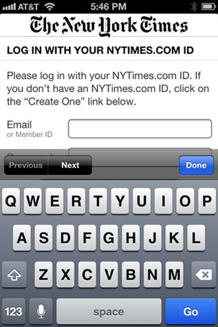
Html5 inputs have been around for several years now, and are fully backward compatible for the less than half percent of users with browsers that don’t support them. So there’s no reason not to use them. Yet thousands of sites, like the New York Times example above, still don’t take advantage of them. But these little beauties can improve the mobile experience so much.
Type=”Email”
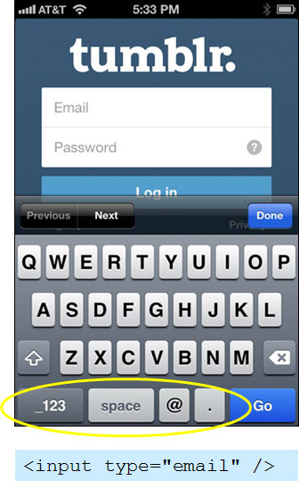
Using “type=’email’ in the input tag defaults to an email-focused keyboard in most mobile browsers.
Use <input type=”email” /> to bring up the “Email” keyboard on a mobile phone. The keyboard will vary from device to device, but almost all smartphones show an @ sign in the keyboard for these form elements. Many also have a “.” Key and a a “.com” key as well, allowing most users to enter their full email address without having to change keyboards at all.
Type=”url”
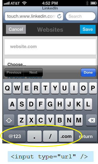
Specifying type=’url’ for the form input will bring up a url-focused keyboard in most mobile browsers.
Use <input type=”url” /> when you’re asking for a website address. Similar to the Email type, this will bring up a default keyboard that typically includes “/”, “.”, and “.com” keys. This will make it easier on your users and faster for them to get through the form.
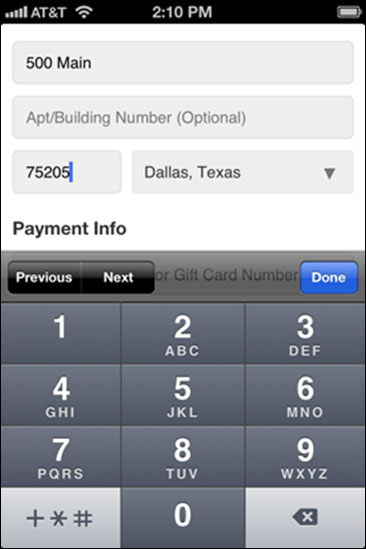
Type=”number” & Type=”tel”
If your input field is expecting a number, then you’re probably best suited to use one of these two input types. The “tel” input type will bring up the telephone dialer keypad on your phone, so it works well for things that will only have numeric data, such as ZIP codes, phone numbers (obviously), quantities, and the like (although as we’ll see below, there are better ways to handle quantities). Typing in numbers is easiest on this keypad because the buttons are so large.
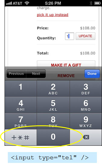
Using type=’tel’ in your input tag brings up the telephone keypad, which is easy to tap for fields that will only contain numbers.
If the value entered into the input field will consist of more than just numeric digits, but you expect it to begin with a number (such as a street address, or something with labels, such as a measurement – “6 feet, 3 inches”), the “number” input can be a good choice that often gets overlooked in these instances.
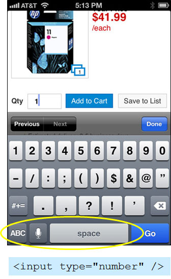
Using type=’number’ in your input will bring up the numeric/symbols keypad in most mobile devices. This is good for numbers, or even fields that will just begin with a number.
That is understandable because semantically, it doesn’t make sense. But here’s the thing—users don’t care about coding semantics when they’re filling out a form. If they come to an address field, and the first thing they do after tapping into it is change into the numeric keyboard, that’s tedious. If you give them the proper keyboard first, they’re happier. Happier users tend to complete forms more often!
A Word About Validation
The html5 inputs come with automatic validation, which sounds great on the surface, but if you’re using things the way I suggest here, the auto-validation done by the browser will not be what you want. If you choose type=”number” for a street address, the browser will most likely think the value entered is not valid. Same goes for most things you enter as type=”tel”.
Html5 makes turning off the automatic validation easy. Simply add the attribute “novalidate” to the <form> tag in your html and the browser will not verify the data entered. You can instead write a JavaScript script to validate it on the user-side if you wish.
Drop the Drop-down Inputs
Since the beginning of web browsers, the drop-down input type has been a staple of forms. And for good reason! It’s a very space-efficient method for presenting your users a set of options from which to choose.
However, it becomes quite a pain to use them on mobile devices. Here’s an example of the Add To Cart section of a product on the ASOS website (British apparel retailer). For most items, to add to the cart you must specify a color and a size. ASOS uses drop-downs for both of these choices.
Think about how many touches & taps it takes just to choose each one. First you tap on the color drop-down. That brings up the “wheel” (as I call it) of choices at the bottom part of the screen. Then you have to scroll to the choice you want. For some phones, you then have to actually tap the choice you want. Then you have to click the “Done” button to get out of the wheel. That’s three or four taps. Then you have to do it all again for the Size. So it took you six to eight taps just to choose those two options.
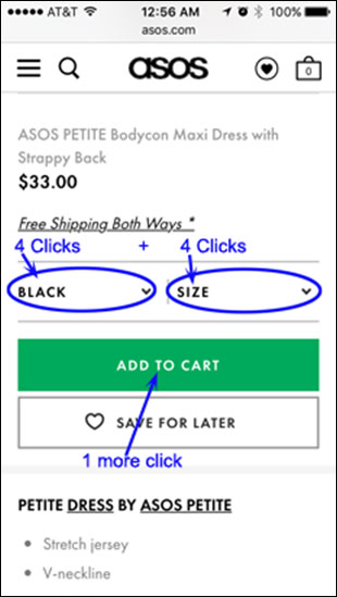
Using drop-down form elements require many more user interactions on mobile devices. It can take eight taps or even more to choose a color & size in this example.
But now look at how it can be done more effectively for a phone. Look at the Victoria’s Secret website, again to their Add To Cart section of a product detail page. Instead of drop-downs for these, they use what I call “Graphical Radio Buttons”. Traditional radio buttons are too small to use on a phone, and even if you enlarge them, they take up a lot of space with a label next to them. But the Victoria’s Secret implementation replaces drop-downs quite effectively.
These form inputs function the same as a radio button. But they are large enough to tap easily, with the label (or actual color swatch) built right in to minimize the space they take up. What took as many as eight clicks on the ASOS site requires only two clicks on the Victoria’s Secret site.
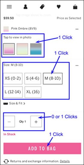
By using graphical elements that function just like Radio Buttons, the user can specify color & size with just two taps on a mobile device. A stepper for the Quantity allows for minimal taps as well.
User Steppers for Things Like Quantities
Another thing Victoria’s Secret is doing well above is using a Stepper for the Quantity field. Many sites use an old-fashioned text box (and if so, I’d hope they would be type=number or type=tel), but this is harder to use on a phone. Again, it takes three or four taps just to enter a value.
A better alternative is a Stepper such as that used by Victoria’s Secret, defaulted to the most logical value (for quantities, that would usually be 1). To change the quantity to 2, it only takes one tap.
Take Your Scalpel To Unnecessary Form Fields
If you’ve been working on your Conversion Rate, you’ve been hearing for years that you should minimize the number of fields in your forms. But this becomes even more important as more and more of your users are coming to your site on a phone. Each additional form field will reduce the likelihood of a mobile user from filling the form out.
Go back and drill yourself, or the stakeholders, on the absolute necessity of fields such as Middle Name, Company Name, Birthday, Phone Number, Best Time To Call, Email Format, etc. Can some of these questions be asked at the end of the conversion process so the large form looks shorter? Can some of them be asked later, via email?
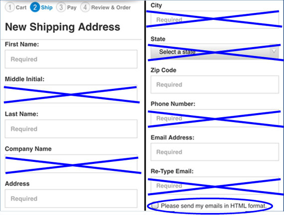
Extra form fields really cut down completions for mobile users. Review your forms and be vigilant about getting rid of all but your most critical fields. Which ones can be determined in other ways, or asked for later?
Some things you can deduce yourself with some technology. If you ask for the ZIP Code, you know the State and probably the City, with the use of a ZIP Code database. You can determine the Credit Card type via the first few digits of the card number.
Seriously consider whether you need to hassle your users with retyping things just to make sure they didn’t make a mistake. Why do you make them repeat their email, but not their shipping address, phone number, etc.? Most of them will just copy & paste from the first field anyway. If someone does mistype a password, a simple password recovery link will take care of them anyway.
Technology Is Your Friend When Dealing With ZIP Codes
Above I talked about eliminating drop-down selects, and some of you probably thought, “But for long lists of choices like ‘State’ you’d still need a drop-down.” I’ve already mentioned how you can use a ZIP Code database to determine the city/state in an address form. For US sites, a pretty comprehensive ZIP Code database costs less than $50 per year and can be used to take that ZIP that the user entered and determine the state. For the vast majority of ZIP codes, you can determine the city too. For the ambiguous ones, you can present the user with a very short list of cities.
Ask the user to enter a ZIP code first, and then determine the city & state based on that.
But you don’t have to stop there! You can help the user by suggesting their ZIP code. They may not have to enter it at all! You can look at their IP address and bump it up against a GeoIP database to get a corresponding ZIP code. This may not be the user’s ZIP code in all situations, but it will be for some people, and for those for whom it is not accurate, it will be close, meaning it won’t take as much work to change. And the user will be impressed, and that will increase their trust in your site.
If you have a drop-down for Country, a geo-ip solution can eliminate the need for the user to go through that process 99% of the time.
Leverage Third Party One-Click Checkout Solutions
If yours is an Ecommerce site, a third party one-click checkout solution such as Amazon Payments or PayPal Express Checkout can really make checkouts on your site a breeze! Such a large portion of consumers have accounts already set up at one or both of these providers, often with full information including shipping & billing address, and credit cards. And in many cases, those users will already be logged in to that provider!
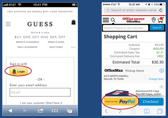
Using one-click checkout solutions such as Amazon Payments or PayPal Express Checkout can really streamline the checkout process for mobile Ecommerce customers.
So by offering these checkout methods, your users can simply click the button and log in (if necessary) and confirm the default choices. That is so much easier and faster than going through two or three steps of a checkout, including entering a long set of credit card information.
Make Your Forms Easier!
Implementing improvements to your forms will take a little bit of effort, but the effort is well worth it. These enhancements will go a long way to increasing the conversion rate for your mobile users. And with each passing day, mobile users represent a larger portion of your overall site usage.
But these are only some ideas that we’ve put into use. I know there are plenty more out there that you have created. And I’d love to hear about them. Please take a moment to comment on things you’ve done to make your forms easier to complete for your mobile users.