


 Ask most online marketers their feelings on Home Page Carousels (aka Image Sliders, Rotating Offers, Slideshows, Faders, they go by many names), and it’s pretty certain that the answer you get will be a passionate one. Many, especially designers, product managers, etc., think they’re fabulous. A great way to get more exposure to a wide range of products on a page.
Others, usually Conversion Optimizers and developers, often think they are the worst thing since pop-up ads.
So who is right? Fire up your favorite search engine and you’ll see there are plenty of opinions on the subject. My own opinion is a pretty strong one on their effectiveness (actually lack thereof). But by investigating all of the research studies I could find on the subject, I do know there are cases where they can be effective.
So what are those case studies? Who are the experts lending their thoughts on this? I researched every study I could get my hands on. There’s more out there than you might think! Let’s dive into what I found!
Testing & Objectives
Whenever you’re trying to research whether something is effective or not, it’s critical to define what you want it to be effective at. For this project, conversions were what I was most interested in. Rotating banners may or may not do a good job of getting exposure to more products, but do they result in more or fewer conversions? In the end, as a website owner, that’s what I care most about.
So when researching the various opinions, philosophies, and studies regarding the use of carousels that are out there, I was most drawn to those that were able to back up their opinions & conclusions with real test data that would show either a decrease or increase in conversions on their site. There is other data available that is useful and interesting, like interaction rates, usability issues that were uncovered, and certainly expert opinions. All of those are quite valuable, but my biggest interest was real data on how a slider affected the bottom-line conversions.
Usability Testing & Usability Experts
We are big proponents of Usability Testing here at Web Site Optimizers. Usability Testing refers to watching real people trying to accomplish one or more tasks using your website (and/or others). Watching them and getting them to voice their thoughts as they go through their tasks can yield incredible insight into the difficulties they have that you didn’t anticipate. It allows you to identify issues that when fixed, will likely increase your conversion rate.
So if a Usability Expert publicly describes issues they see when they do their testing, I take note!
Adam Fellowes, EE Limited
Now managing the digital User Experience team at EE Limited, Adam described observations from many usability tests back in 2011:
“Almost all of the testing I’ve managed has proven that content delivered via carousels are missed by most users. Few interact with them and many comment that they look like adverts — we’ve witnessed the banner blindness concept in full effect.”
Craig Kistler, Signet
Craig is the User Experience & Information Architect Manager at Signet Jewelers, and is also the Founder of CRO firm Strategy & Design, as well as the Owner of Small Farm Design. He’s been watching user tests for more than 15 years, so he’s seen plenty of tests that include landing page carousels. Craig was to the point in 2013 when he commented about the tests he had seen:
“In all the testing I have done, home page carousels are completely ineffective… In test after test the first thing the visitor did when coming to a page with a large carousel is scroll right past it and start looking for triggers that will move them forward with their task.”
Lee Duddell, WhatUsersDo
Lee founded London-based remote usability testing tool WhatUsersDo back in 2008 and still runs the company. He’s been observing usability testing even longer. And of course, many of them involved rotating sliders. Lee’s comments were perhaps the strongest of all after “observing thousands of tests” in 2011:
“They are next to useless for users and often ‘skipped’ because they look like advertisements. Hence they are a good technique for getting useless information on a home page… Use them to put content that users will ignore on your home page. Or, if you prefer, don’t use them. Ever.”
I’d say his thoughts are pretty clear!
Opinions Are Great, But What About Numbers?
The people above are all certainly experts in the field of User Experience, so their comments are of value without question. However, there is no actual test data mentioned in any of that testimony. And for that matter, Usability tests are not statistically significant. They reveal issues that should improve the site, but you don’t know for sure without some scientific testing.
Scientific testing is carried out via methods such as A/B testing, where a version of the page with the carousel is shown to half of the site’s visitors, and a hypothesis version without the carousel is shown to the other half. We then wait to see if one version significantly outperforms the other, in terms of conversions.
Unfortunately, it’s not so easy to find real data from tests run in the past. Test results are generally considered strategic information that companies don’t want their competitors learning about.
Still, some companies and testers have graciously made public their test results on image sliders & carousels over the past few years. The majority of these tests have concentrated either on how often rotating offers are interacted with, or their effect on conversion rates. So let’s look at both.
Carousel Interaction Studies
The expert comments above talk mainly about the fact that users tend not to interact with, or even read the content in home page carousels. And while those experts don’t back that up with data themselves, there are studies out there that do just that. There are studies that have been made to determine how often carousels are interacted with, and which slides in the group get the most attention.
Non-Profit Sites Tested By Beaconfire RED
Beaconfire RED is a digital marketing agency in Arlington, VA. They do a lot of work with non-profit clients, and in 2011 they conducted a study involving the websites with carousels of four of their non-profit clients. The data showed that these carousels were rarely interacted with. The Click-Through-Rate (CTR) of the carousels on these four sites was well below 1% in aggregate. It was also clear that when there was a click, it was the first slide of the rotation got it the vast majority of the time.
The overall click-through rate for carousels in Beaconfire RED’s study of four non-profit sites was very low, under 1%. The initial item in the set was always the most clicked by far.
The takeaway for Beaconfire RED was clear. “People might notice the first couple slides, but they’re not likely to click, and beyond that, no one is even seeing them.”
Notre Dame University
In 2013, Notre Dame University web developer Erik Runyon posted some of the most detailed study results regarding user interaction with sliders that exists to date. He ran one study on the main ND website, and the results showed that only a little over 1% of the visitors clicked on the carousel at all. And 84% of those who did click, did so on the very first slide in the group.
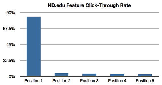
This Notre Dame University study showed that nearly 90% of the clicks on the carousel were done on the 1st image in the set.
Runyon also studied carousels on four other Notre Dame websites. These showed slightly improved performance, with one pulling in a click rate of 8.8% (the other three were between 1.7% and 2.3%). Erik did expect these higher click-through rates since these sites had visitors that were much more targeted. But even for these, the vast majority of the clicks were to the first item in the rotation.
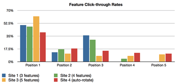
CTR data on 4 additional websites in the Notre Dame study saw higher click rates, but the first item in the set was still by far the most clicked item.
Conversionista & Grizzly Zoo
Swedish Conversion Optimization firm Conversionista conducted an image slider test for one of their clients, online pet store Grizzly Zoo, in 2012. In this test, the control was a Home page that had a large carousel, and it was tested against the same page, but with a static image in place of the carousel. Not only did they track engagement via clicks to the slider or image, but they also used eye-tracking technology to analyze where users were focusing their attention while on the page.
Users who were shown the control version “seemed to avoid the slider and did not click on it.” But on the test version (the one with a fixed image), the eye-tracking data revealed “a drastically improved interest for the top area and a substantial amount of users also chose to click on the new version.”
This was backed up by the numbers in the study as well. The version with the static image received clicks over 40% of the time. The slider version was clicked only 2% of the time.
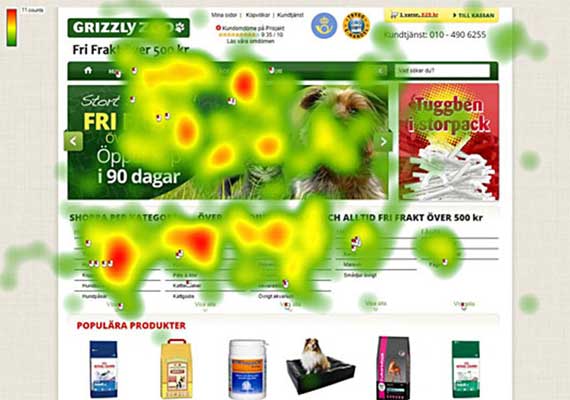
The user-focus heat map from the GirzzlyZoo study showed that users virtually ignored the carousel on the home page completely. (Attention spots that appear to be on the slider are actually on the drop-down menus from the nav area.)
University of York
In 2013, Paul Kelly of the University of York was inspired to track clicks on a rotator on the university’s site, after reading about the Notre Dame study. Paul’s study results include a breakout of which slides received the most clicks, but not the overall CTR for the rotator.
In this study, the first slide received about half of the clicks in total, supporting the theory that the first slide of the rotation tends to receive by far the most clicks (and it would follow, the lion’s share of attention from the users as well).
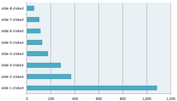
This study from the University of York showed once again that the fist slide in the rotation gets the vast majority of the users’ attention.
Hall Internet Marketing Tests
Caitlin Frank, of Hall Internet Marketing released a small amount of test results regarding tests her company had performed for various clients, measuring clicks on carousels vs static images. Like most, she could not go into much detail on those results, but in most cases, the static images got more clicks.
“The results from one of our tests for a client in the food production industry yielded an increase in overall click conversions by 29% on the static banner compared to a rotating banner. In another test we ran for a client in the pest service industry we found a static banner outperformed a rotating banner by increasing clicks by 24%. Static banners don’t outperform in every industry though, we found that overall clicks on a rotating banner of 4 slides outperformed a static banner for a client in the health, wellness, and fitness industry.”
Harrison Jones Data
Also in 2013, Harrison Jones currently an Analytics & Testing Lead for Envisionit, published some click data for three websites that used home page carousels. Each had a different objective, but all three had poor click through rates. The best was 0.65%, and the worst was 0.16%.
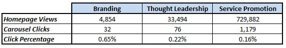
A study by Harrison Jones of 3 websites, each with different strategies, using Home Page sliders. In all three cases, clicks to any slide on the carousel were quite rare.
Orbit Media
Orbit Media is a web design firm in Chicago, and one of the founders, Andy Crestodina, shared some data with me regarding a test between an image carousel and fixed image on their website.
In their 2016 testing, Andy found that the version with the fixed image generated almost three times the number of clicks that the version with the carousel had. “The winner was clear,” according to Andy.
Orbit Media tested their site with a static image vs a home page slider, using clicks as the goal. The static image garnered almost 3 times the number of clicks as the carousel.
Mobify Slider Data
The traditional implementation of a slider on a home page rotating from one product or offer to another is not the only way to use them. Mobify’s Kyle Peatt reported the results of data he had been collecting from several mobile ecommerce websites that used sliders differently.
Instead of Home Page carousels, these sites, each of which generated at least $20 million of ecommerce revenue per year, employed a slider on the product detail page in the shopping process. The slider showed the product from different views or in different contexts to aid the selling process. Further, these sliders did not advance automatically, but would advance when the user swiped them with a finger. A user could tap an image to zoom in, and Peatt equated this as analogous to clicking on an image in a traditional desktop carousel.
The interaction numbers in this kind of use of sliders were expectedly much better. The study lasted 11 months and consisted of more than 7.5 million interactions with the sliders. In this time, 72% of the users coming to a product detail page chose to advance the slider at least one time. And 23% of them decided to tap an image to zoom in.
The first image in the slider was still the one most often interacted with, but the difference was not as great as in the earlier studies. Here, about 54% of the zooms performed were on the first image. But the second image was zoomed 16% of the time, which is a much lower dropoff from first to second slide than the studies described above.
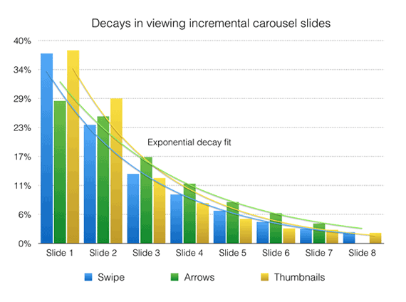
In Mobify’s study of sliders for product images on ecommerce product detail pages, the first image still got the most clicks, but the drop-off to the second and successive slides was not nearly as drastic as in other studies. This kind of use for an image slider is probably a better use.
So there’s a lot to learn from this. Just maybe, it’s not the carousel itself that is ineffective, but rather how it is used. Having a home page carousel that spits out several unrelated products or messages may not be too effective. But when used in a more specific context, such as on a product page, and where it adds more information to a consistent topic, it can possibly aid the objective, rather than detract from it.
You Promised Me Conversion Data
You’re right. Knowing how often people are paying attention to the slider is nice, but as I said at the outset, I’m mostly interested in what affect carousels have on conversions. Do they help, hurt, or have no effect at all?
As I say above, the only way to determine that for a given site is through a scientific A/B test, comparing bottom-line results for two different versions of the page: one with a carousel, and one without.
It’s true that most companies have no desire to publish results of any tests they conduct. But there are some who have been willing to talk about the results of tests they have conducted. Some do this by describing results of specific tests, but without giving up specific numbers. Others have provided the final data as well. I took in everything I could find.
Anecdotal A/B Testing Reports
While most agencies are not at liberty to discuss specifics about the tests they run for their clients, some of the biggest names in Conversion Rate Optimization have discussed A/B testing they have done regarding rotating banners in general terms. Even without the exact data, the information they are willing to divulge is worthy of our attention.
Chris Goward, WiderFunnel
Chris is the founder of one of the most well-known CRO agencies, WiderFunnel, as well as the author of the book You Should Test That! Chris discussed some past A/B tests regarding carousels back in 2011:
“We have tested rotating offers many times and have found it to be a poor way of presenting home page content.”
In 2013, Chris said, “I don’t have public case studies I can share, but can tell you generally that we’ve rarely seen them win in a test.”
Craig Tomlin, WCT & Associates
Craig Tomlin has been involved in UX consultation since 1996, working with firms such as Kodak, IBM, and Disney. He is one of the most experienced usability professionals around, and he referenced testing on hundreds of sites with carousels in an article he wrote in 2014.
Not only did he find that click-throughs averaged less than 1% on the sites he had tested, but more importantly, that conversions were reduced.
“Among the hundreds of website audits I have completed in which carousels were causing poor conversion, when my clients killed their carousel, they typically increased their conversion significantly. The message is clear, kill your carousel before it kills your website!”
Tim Ash, SiteTuners
Probably the biggest proponent for removing home page sliders is Tim Ash. Tim literally wrote the book on Landing Page Optimization, and is CEO of CRO firm SiteTuners since 2002. He is also the founder of the national CRO conference, ConversionConference. He has helped over 1200 companies with their Conversion Optimization needs. In short, he knows his stuff.
He’s also about as outspoken as they come regarding the evils of home page sliders. And yes, he has called them “evil”. In 2011 he commented, “rotating banners are absolutely evil and should be removed immediately.”
He continued the theme in 2014 when he said:
“The evil truth of rotating banners is that they do the opposite of what’s intended, distracting users away from your most important content.”
And in 2015, Tim posted, “There’s multiple explanations from my site about why it [rotating banners] steals attention from key tasks, and a range of other experts agree that they don’t work.”
I’m pretty sure I remember him saying at a conference once that rotating banners kill kittens. Honest.
A/B Testing Case Studies With Real Data
Just because the experts above did not have permission to quote specific data, they do refer to actual tests. But if it’s actual studies with real numbers you want, there are a few of those available as well.
Blair Keen, Adobe
In 2013, CRO consultant Blair Keen talked about an A/B test he conducted at Adobe for one of their clients in the financial services industry. In this particular test, Blair didn’t compare a version of the page with a slider to a version with a static image. Instead, he just removed the slider entirely for the test version, moving all of the rest of the content up the page.
The results? The version without the carousel had a 23% lift in sales.
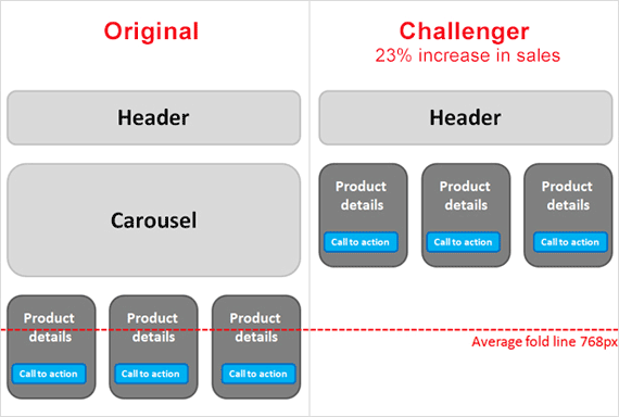
By simply removing the slider entirely, without replacing it with any other content, Adobe found a 23% lift for one client.
ServerTastic
ServerTastic is a reseller of SSL digital certificates that conducted some A/B tests on their Home page in 2013 around the use of carousels. ServerTastic’s Andy Gambles reported a 16.48% increase in revenue per visitor for versions of pages without sliders compared to those with the slider.
But things didn’t end there. There was some positive news for the sliders. In addition to just total revenue, ServerTastic also tracked how many people signed up to become resellers of their certificates, which was another positive conversion for ServerTastic. Since it was free to sign up, this was only a micro-conversion for the site, but signups do present a chance for more revenues in the future. And interestingly, the reseller signups actually increased on visits to the page with the slider by 29%.
When all was said and done, however, ServerTastic decided to drop the carousel, citing declining CTRs on the carousel along with the decreased immediate revenue.
Conversion Sciences – A Carousel Win
Brian Massey, founder of Conversion Sciences, published some interesting information regarding his agency’s attempts at optimizing carousels in 2014. Brian agrees with others who say that your average slider will underperform compared to a static image. However, he also clearly feels that a properly implemented carousel can actually beat a static image. And he has proven that.
However, it was treated as a process that took several tests to arrive at a carousel that would work best. Brian’s team began by testing each image in the carousel as a static image on its own. They looked at the results of those tests and tried setting up a slider with those images, in the order of their individual test performances.

Conversion Sciences managed to get a winning test from an image slider by optimizing the order of the images within the slider. This outperformed all static image versions by 61%.
The page with this version of the carousel beat the best performing individual static image version with a conversion increase of 61%. If you do have to have a carousel on your site, I strongly encourage you to read the entire post on the Conversion Sciences blog about this, as it is full of learnings on how to optimize sliders to perform as best as possible.
Device Magic Video Test
Mobile forms company Device Magic ran an A/B test in 2012 centering around a carousel on their home page. Their home page at the time showed an informational video that explained their product. But they worried that the production quality of the video was poor and that the video itself was too technical, and that these combined to hurt conversions. They decided to test the video against a version of the home page that replaced the video with a slider that tried to communicate the same information in five slides.
When the test had finished, the version with the carousel showed a 35% lift in signups for the Device Magic service compared to the version with the video. We have another test where the carousel wins!
But as the blog post mentions (as well as several commenters), outperforming a poorly produced video is much different than beating a quality image.
But like the Mobify study above, what we do learn here again is that there are certainly different uses for carousels. A carousel that tells a story and engages the user from one slide to the next is probably a better way to use it than just putting up four or five different products or conflicting offers. (As of the writing of this post, the Device Magic site does not use either a slider nor a video on its home page.)
So Is There A Final Answer?
Clearly there are a lot of opinions out there, and there is a lot of data, both in favor of, and against, the use of carousels on your site. But like most other decisions regarding the content of your site, in the end the answer is to define objectives and test! Your site is different than everyone else’s, and so are your customers and visitors. So you really have to test your options to determine what should be most effective for your site.
If you can’t A/B test your site (perhaps your traffic is too low), don’t give up. Use your analytics tool to measure how often each slide is viewed and clicked. This can help you learn what engages users most, and what your visitors are most interested in.
And if you do choose (or are forced to choose) to use a carousel, there is a lot you can learn from the tests discussed above to help you make yours as effective as possible:
- Put your most important, top performing slide first. Many people will never see the others.
- Allow the user enough time on each slide to read it and take in the information before it advances to the next slide.
- Fast motion distracts users, taking them away from other important areas of your page. So use a soft fade as the transition from slide to slide to decrease that distraction.
- Moving from slide to slide must be easy. Make Previous and Next arrows easy to see and stand out against any background in the slider. And make the large enough to tap easily, even on a phone.
- Include the capability for mobile users to swipe left or right to advance the carousel. Don’t force them to find the arrows.
- Make sure the carousel loads as optimally as possible. This is especially critical for your mobile users. Compress the images uses as much as quality allows. Load later slides in background since most users won’t get to them.
What Are Your Results?
As always, it’s your turn now. I imagine that at least three-fourths of the people reading this post already are using a carousel on one or more of the sites they are responsible for. Are you recording metrics on its use? Are you tracking how often each slide is being clicked? Tell me your results!
Or even better, run an A/B test against a version you think will improve your results. Get the data and share it with all of us here in the comments section. Help everyone know more about the good, bad, and ugly of home page carouels!


