


Ever since Apple’s introduction of the iPhone in 2007, most website owners have had their eyes on mobile visitors to their sites. At first it was just cool that people could access the site from anywhere, but with the explosion in smartphone usage, site owners’ focus shifted to improving conversion rates from mobile users.
This has been especially true in the Ecommerce world. In 2011/2012, desktop visitors to Ecommerce websites were five times more likely to order than mobile visitors, according to Monetate. That gap has narrowed in recent years as sites have worked to improve mobile conversion, but desktop conversion rates are still two to three times better than mobile.
And as mobile traffic makes up a greater and greater portion of a typical online store’s traffic, marketers continue to address mobile conversion on their websites.
But leading sites have noticed an evolution in mobile Conversion Optimization, and are riding it to better Customer Experiences, and better mobile revenue.
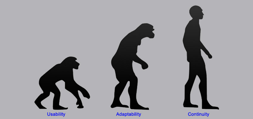
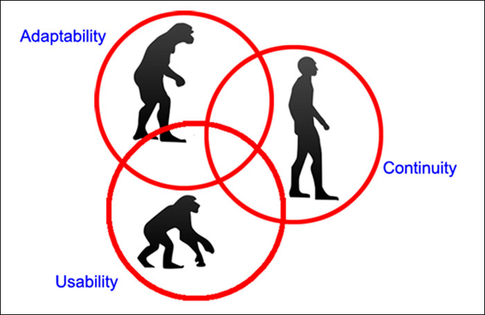
Stage 1 – Usability
This is the natural first step in trying to improve conversion rates for mobile users: address the areas of your site that are harder to use on a mobile device. For many site owners, that started with making the content easy to consume via Responsive Design.
Unfortunately, for many site owners, it also ended there. In fact, for many sites, the solution has been to just implement a mobile theme and assume that the entire site is now easy to use on a mobile phone. Blindly using a canned mobile theme without further customization can cause several problems, but that’s another post.
But there are a lot of things you can and should be doing to improve the mobile usability of a site beyond simply making it easy to view. Smarter Ecommerce site owners started evolving even within this own evolutionary stage and improved the usability of their site in other areas.
They improved their site navigation. They utilized HTML5 input field types to pull up the proper keyboard for users when entering information. They took pains to reduce the page load times over slow cellular networks. They made their forms easier to complete for mobile users. They implemented one-step checkout options.
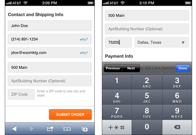
Using the ZIP code to determine the city and state of an address can be a big usability improvement to make checkout on a mobile device easier.
Websites that go the extra usability mile via improvements like these are certainly seeing results through better mobile conversion rates, and that’s great. But many realized that they couldn’t just stop there. For a small percentage of sage strategists, an evolution in approach to marketing to mobile users was required.
Stage 2 – Adaptability

You know you’ve started to enter the second phase of the Mobile Conversion Evolution when you realize and concentrate on one key point: the difference between mobile and desktop is the user, not the device. The more attention you pay to this, the better chance you’ll have at making big improvements to your mobile conversion rate.
It starts with the environment. Think about desktop users and mobile users. Desktop users are typically at their office or in their home, most likely in a quiet or at least semi-quiet spot. The task they are working on at your site is probably the primary thing on their mind at that time.
But mobile users can be anywhere, doing anything. They might be standing in line at the grocery, at their kid’s soccer game, waiting for their food at a restaurant, walking through an airport in an unfamiliar city, in a moving car (hopefully as a passenger). You get the idea.
People visiting your web from a mobile device are usually doing something else as their primary task. As such, there attention span is shorter and they are probably less patient.
The mobile user’s world is full of distractions. There are all kinds of things happening all around them, competing for their attention. In fact, using your website is probably more often a secondary task they are working on during brief pauses in whatever their primary task is (watching that soccer game, eating a meal, etc.)
Because of all this, the probable biggest difference between a mobile user and a desktop user is that a mobile user is in more of a hurry, and therefore, less patient. And catering to that difference is a big step to converting them.
What Do Mobile Users Need From Your Site?
So now that you’re thinking about how your mobile visitors differ from your desktop visitors in terms of environment and situation, the next logical step is to think about how that translates to how their needs differ from each other.
This is key because of the decrease in patience from your mobile users. Your desktop experience should be broad, to support all the users who are trying to accomplish a wide variety of things. There can be lots of different things mobile users need from your site too, but most of them share the same one or two primary objectives when coming to your site. It makes sense to make those tasks as easy to complete as possible.
The best way to do this is to focus the content and choices to prioritize those needs. You’re adapting the site content and structure when the visitor is on a mobile device to their needs best. Hence the term “Adaptive Design”.
Adaptive Design Has Been Used for Decades
If you think adapting content & options to a user’s situation is some new concept unique to the Internet or Ecommerce, you’re sadly mistaken. It’s been going on for decades (centuries, probably).
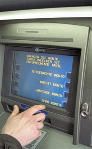
Bank ATMs debuted decades ago. They’ve always offered specialized content & options specific to mobile bank customers.
Think about Bank ATMs. Those have been around since the early 70s. Now you can do a whole lot of things at the local branch of your bank like applying for a loan, get investment advice, etc. But people using an ATM are doing so because they are in a hurry and have a short transaction to complete.
So the options available to users of an ATM are limited. Simple things like withdrawing or depositing money, checking your balance, etc. This is a perfect example of how different channels provide different content to their users based on their mobility. And it’s been going on for 50 years.
Put your mind to it, and I think you can come up with many more examples of Adaptive Design that go back even farther.
Good Mobile Shopping Experiences Take Advantage of Adaptive Design
So let’s come back into the 21st century and the mobile shopping experience on websites. We’ve established that in this context, Adaptive Design refers to adapting the content and options to focus on the primary needs of your mobile users.
Here’s a good example of this from American Airlines. Take a look at this screenshot from their Home page when viewed on a desktop. It’s a good Home page, with easy access to any of the numerous things you might want to do while on their site: making a reservation, joining the Frequent Flyer program, looking at future flight schedules, even getting an American Airlines credit card.
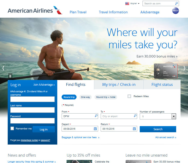
The aa.com desktop version offers all kinds of options for the user to do, including booking flights, joining a frequent flyer club, and evening applying for a credit card.
Now look at the Home page when viewed on a mobile phone. You can still do most of the same activities, but those that mobile users need to get to fast are most prominent, most easy to start & complete. The top choices on that Home page are all tailored to things people might be doing while they’re on their actual trip, probably in or on their way to the airport. And that makes total sense for the mobile user of an airline site.
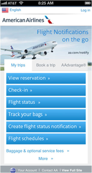
The mobile version of aa.com’s website prioritizes the activities that people need during their actual travel.
Mobile users of aa.com are likely to need to do things like view their reservation, check in, or see the status of their flight. Those things are also prominent on the desktop Home page, but they are the very top choices for the mobile version.
And look at the next two choices. “Track your bags” and “Create flight status notification”. I’m sure you can do these things from a desktop, but they are not quick links from the desktop Home page.
But they are very much things that would be of greater importance to a large portion of mobile users. If you’re at the airport after a flight and your bags are lost, you’re frustrated and in a hurry. You don’t want to have to go looking several levels deep on the website to find a Track Your Bags option.
Smart companies are taking a more adaptive approach to their mobile shopping experience. But even smarter companies are learning there is yet another stage to the evolution.
Stage 3 – Continuity

If you’re making your site easier to use for mobile visitors, and prioritizing your content and options to meet their biggest needs, that’s great. Your conversion rate is probably benefiting from it.
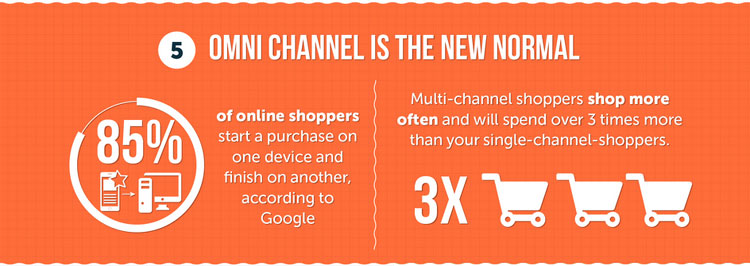
But the next phase in the Mobile Conversion Evolution involves the understanding that the Customer Experience spans many sessions. According to a recent Google study, a whopping 85% of online shoppers begin an ecommerce purchase with one device and finish it on another.
The next phase in the Mobile Conversion Evolution involves the understanding that the Customer Experience spans many sessions.
With the explosion of mobile usage over the past couple years, this makes sense. Mobile accessibility makes it easy to research a product at a moment’s notice. It’s a logical thing to do while you’re waiting in line or something similar and have your phone handy. It’s also quite common while shoppers are at a physical store. So it makes sense that the first visit to a shopping website is more often on a mobile device than on a desktop.
But as we know, people still prefer to actually make the purchase on a desktop. So many will use that phone to do their research, either in one session or multiple sessions, before making a decision of whether they will buy something (and which store to buy from). And while some of those people will start & complete the purchase on their phone, many more will just wait and go place the order on their desktop.
How are marketers reacting to this trend? The smart ones are facilitating it—making it easier for shoppers to continue their session from one device to another. After all, the battle you should be trying to win as a retailer is getting the customer to choose to buy from you. After that, you are supposed to be home free.
But think about how easy it is for that customer to forget who they chose when they get home and want to place the order. Most of the time, they’re going from memory here, either trying to remember what they searched in Google, or trying to remember the name or url of the site where they want to order.
So marketers in the Continuity stage of the evolution are trying to facilitate that path from mobile research to desktop conversion. The basic level of this involves allowing the potential customer to add something to their cart on their phone, and easily access that same cart from their desktop (or any other device). There are a number of ways to accomplish this.
User Accounts
The oldest and most common method of accessing an in-progress shopping cart from a new device is via user accounts. User accounts have been part of the Ecommerce environment almost as long as stores have been online. And while they typically exist for other benefits, it should be an easy exercise to visit a site, log in, add something to your cart, then later from a new device, visit the site and log in again, and see your cart already populated.
Customer Accounts can offer a lot of benefits for certain kinds of online stores, but they are not especially reliable for multi-device continuity of a shopping session.
Except it’s not that easy. For one thing, that process involves someone logging in twice. And users typically don’t log in until they need to. A more likely scenario to the above is for the user to visit the website and add something to the cart without logging in, and then hoping to log in later from a different device, only to find the cart not populated.
Besides that, user accounts don’t offer a lot of benefit for many stores. They’re great for stores like Amazon with a broad product line and where users order very often and ship to many addresses. But for smaller stores, features like Wish Lists and Address Books don’t get used very often. So these stores often don’t bother with the functionality at all. After all, not setting up an account does make the overall checkout process easier.
Email Your Cart
A method of facilitating the Continuity that is growing is allowing your customer to email their saved Cart to themselves. This allows them to access the cart from any device without the need of a login.
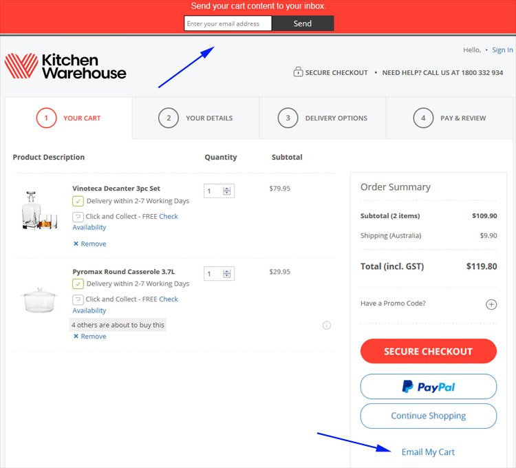
Kitchen Warehouse offers the ability to Email your cart to yourself (or someone else). Clicking the link at the bottom brings down the bar seen at the top to provide an email address and send it. That email can be accessed from any device and the shopping session can be continued.
The View Cart page will have a button on it that might say something like “Save and Share Cart” or “Email Your Shopping Bag”. Your shopper can click that button, and they get an overlay much like they would when clicking to share something socially. The overlay will ask the email address to send the cart to, and when they enter it, an email with a link is sent.
Later, using another computer, the user accesses their email and opens the message and clicks the link. The link takes them straight to the View Cart page with a fully populated cart of the items they are considering ordering. No having to remember the store name or url. No logging in. It’s quick, seamless, and easy.
Cart Recovery Emails
Cart Recovery emails came about in attempt to reduce overall cart abandonment rates. And they are very effective at doing just that. How do they work? When someone adds something to their cart and begins the checkout process but does not finish it, if they’ve gotten far enough to provide their email (which the merchant in these situations will typically make the first piece of information requested), they later receive an email prompting them to go back and finish the order.

Originally intended merely to reduce Cart Abandonment, cart recovery emails like this one from Bloomingdale’s also have the added benefit of acting as a kind of automatic “Email My Cart” function to facilitate multi-device shopping.
Cart Recovery programs have been successful at salvaging orders that otherwise would likely have been lost. But they’ve had an unintended benefit as well. They serve as an automatic method of saving a customer’s cart for use on another device.
It’s a similar process to the Email Your Cart method described above, except that so long as you already have the customer’s email address, there is no need for the customer to take the initiative of saving the cart. The email is sent to them regardless, and that email allows them to access their cart from any device. (At least it should—we tested some sites where this inexplicably did not work properly. So make sure your system works across all devices.)
Which Stage Are You In?
When I introduced this 3 stage model at the beginning of this post, I presented it as a linear evolution, but it doesn’t have to be that way for you, and it shouldn’t be! You could, and should, be implementing enhancements to your website that are part of any or all three of these stages.
Don’t wait until you think you have every possible usability issue ironed out before you start thinking about adapting the content for mobile users. And even if your content is identical for mobile & desktop users, if you have a solution ready to facilitate the continuity from one device to another, of course you want to implement that now!
While historically, I’ve seen these three stages as an evolution that many sites, and the ecommerce industry as a whole have gone through in a progression, those three stages now coexist. All are important, and most websites, ecommerce sites in particular, can improve in each of those areas.
So where is your site in this model? What are some other methods you can use to improve your site within one of these three stages? Share your story in the comments section below!