


Email Marketing is an important component of the online marketing strategy for any business. And like any marketing tactic, if you’re going to do it, you want to do it well! Certainly for email, this means making the message as easy to read & interact with as possible.
That all begins with making the message easy to read, and in the past few years this has gotten more challenging with the explosive growth in mobile usage. We all know that mobile web usage is growing at fantastic rates, but email is at the leading edge of that. Litmus estimates that 54% to 56% of emails are opened on a mobile device.

According to Litmus, at least 54% of emails are opened on mobile devices. This estimate is probably a little low!
I suspect these numbers are slightly understated, as they don’t count people using email clients such as Gmail from their mobile phones. Regardless, these days it is critical that your email be easy to read and use on a wide variety of devices & clients!
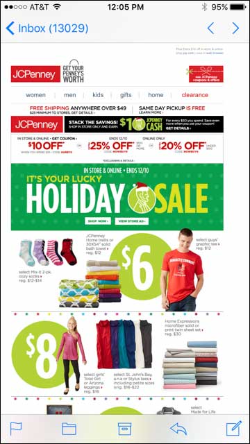
Take care to ensure your emails are easy to read & use on phones as well as on a desktop. This email from JCPenney when viewed on a phone is just a “shrunken” version of the desktop.
If your email messages, when viewed on a phone, are just shrunken versions of a wide desktop message, you’ll get little interaction with them. Your customers will have troubles reading them, tapping on links & buttons, and will quickly stop opening messages from you.
A Natural Solution Seems To Be Responsive Design
Responsive Web Design has been around since 2010, and it remains a method for formatting for mobile devices beloved by designers & developers alike. Even Google recommends Responsive Design as their preferred method for dealing with websites on mobile devices.
So it’s only natural that when dealing with the same problem for Email, designers & developers would turn to the same solution. And if all of your recipients are using email clients that support Responsive Design, it’s great!
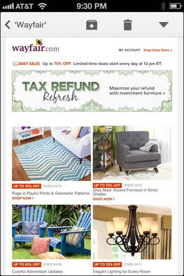
Here’s an example of Responsive Design in action for emails. Home furnishings retailer Wayfair sends out an email that looks like this on a desktop.

An email from Wayfair as shown in a desktop client.
The example above does a good job of highlighting the featured products with some basic descriptions & a Call to Action for each.
Now look at the same message when viewed on an iPhone.
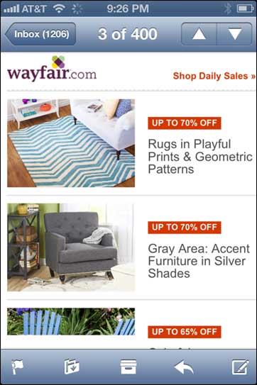
The same Wayfair email on an iPhone, which supports Responsive Design. Text is easy to read, buttons are easy to tap.
This too looks great. The screen is much narrower (in this case, just 320 pixels), but the text is big and easy to read, with a larger button to tap highlighting the price discount. The text is moved alongside the photo of the product instead of underneath it to allow us to see more items in one screen. Nice job Wayfair!
But What About Clients That Don’t Support Responsive Design?
Oh that’s right. Not all email clients support Responsive Design. According to Litmus, only about half of the top mobile email clients support Media Queries (the cornerstone CSS component necessary for Responsive Design). And according to Campaign Monitor, none of the top desktop email clients support Media Queries.
So what happens if someone is viewing your Responsive email on a client that does not support Media Queries? It might not be so easy to use now. Consider the same email from Wayfair above, but when viewed in a client that does not support Media Queries.
In an email client that does not support Responsive Design, the responsive email can be very difficult to read. Wayfair’s email now has text too small to read and tiny buttons difficult to tap.
Now those photos are placed side by side again, which is not so bad, except that the text is so small you can’t even read it. And you have these tiny little buttons & links that are almost impossible to tap. Even the big banner at the top takes some squinting to read for old eyes like mine!
So What’s A Marketer To Do?
The good news here is that an email is not as complicated as an entire website, and thus does not necessarily need as sophisticated a solution to the mobile/desktop mix. A website has many different messages across its pages, targeted to a wide range of different visitors.
Marketing Emails are more targeted, with a limited message. They are one page, not a set of hundreds. Your recipients will only stay on your message for a few seconds to take in the message and hopefully click through to your site.
So that means that we have more options with our approach to Email Design & Development.
Narrow Your Width
The heart of the problem is that a message that is wider than the width of the screen on the phone will automatically be shrunk to fit within that screen. This generally makes the text too small to read, buttons too small to tap, pictures to tiny to be effective, etc.
One simple solution is to just start with a narrower canvass. If your original message is not as wide, it will not be shrunk as much. We recently surveyed the emails of 34 major businesses and found that more than two out of three sent out emails 640 pixels wide or wider. Retailer Target sends out messages 768 pixels wide. Messages this wide will be shrunk 40% – 50% when viewed on a 320 or 360 pixel phone.
But if you start with a narrower design to begin with, the message will not be reduced nearly as much. Victoria’s Secret takes this approach. Their messages are 520 pixels wide. When reduced down to 360 or even 320 pixels, their messages are still easy to read and use.

An email from Victoria’s Secret is only 520 pixels wide, so it is only slightly reduced when viewed on a 360 pixel phone. So it’s still easy to read & use.
Follow The Traditional “Mobile First” Approach
Another mantra in good User Experience design these days is “Mobile First”, and I can’t emphasize that approach enough across all forms of web design. Part of that concept includes starting your design at the narrower widths of the most common mobile devices, and adapting that design to the larger devices. It’s easier to account for a canvass expanding than shrinking.
This message from Bobbi Brown Cosmetics is a wonderful illustration of this approach.
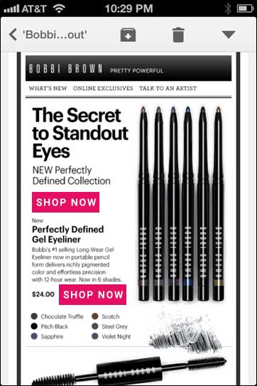
This email from Bobbi Brown Cosmetics was clearly designed first for a mobile device. It uses big bold text and easy-to-tap buttons
They start with a canvass of just 520 pixels so things won’t be shrunk too much, even for a 320 pixel phone. Some of the text is a little small, but the headlines and subheads are nice, big, and bold. The product images are large and detailed, so that when shrunk down they are still enticing to the user.
There are navigation links at the top of the message, and while they are somewhat small, they are still big enough to read, and more importantly, they cover enough real estate that they are easy to tap.
Will This Look Poor On Desktops?
Some people worry that starting with a more narrow canvass, the message will look weird on a big desktop screen. But those fears are unfounded.
For one thing, most emails are not displayed in a full-screen window. In today’s world of wide screens, many people have their email client in a window that only takes up part of the screen. And email messages themselves are usually either displayed in a pane that only occupies part of the email client window, or in a narrower separate window.
For these reasons, most Email Service Providers have for years recommend designing emails to widths of 600 pixels or less. Even if some companies are expanding the widths of their emails, readers are quite used to emails at 600 pixels wide or narrower.
But if you’re designing your emails using html tables, you can still easily code things up so certain columns can expand as the width of the viewing window expands. This does not take any CSS and would work fine in all email clients.
Take Care Of Your Mobile Customers
It’s most likely that more than half of the emails you send are read on mobile devices. What methods are you using to ensure that all of them can read your message easily? I’m anxious to hear how you’re handling this. Leave a comment below to let us all know!