


By now, we all know about cart recovery emails, where a merchant will send customers an email encouraging them to complete an order after the customer has abandoned their cart. I imagine most of you reading this have received examples from your own online shopping. So while the concept is not new, and has been proven to be a successful method of recovering some abandoned carts, most ecommerce companies are either not yet utilizing abandoned cart emails, or have done little to optimize them, to make them as effective as possible.
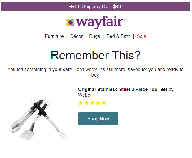
Cart recovery emails such as this one from Wayfair have been very effective at turning abandoned carts into completed online orders.
An Important Component of Your Marketing Plan
For Ecommerce merchants, one of the biggest challenges faced is Cart Abandonment. Back in 2005, estimates of Cart Abandonment Rates were typically around 70% – 75%. Today, more than a decade later, they remain at the same levels. Finding ways to convince people who have shown an interest to complete an order remains a merchant’s greatest opportunity to grow revenues.
A Cart Recovery Email program is one of the best methods out there to reduce your site’s Abandonment. According to SaleCycle, these remarketing emails are opened more than twice as often as regular email marketing messages, and the conversion rate for those who click is about one-third. The numbers from our own customers’ cart recovery emails are even higher. So it’s an incredibly cost-effective way to reduce Cart Abandonment on your site.
(Of course, another extremely effective method is to understand the problems experienced by people who want to complete the order but can’t for some reason. Usability Testing is by far the best way we’ve found to identify those issues. If you haven’t performed Usability Testing on your site in a while, investigate doing that today!)
Added Bonus: Bridge from Mobile to Desktop
After Cart Abandonment, perhaps the biggest challenge Ecommerce merchants face is improving the conversion rate for their ever-growing segment of mobile visitors. It’s very common for conversion rates among mobile users to be one-third to one-half that of desktop. But the mobile share of the traffic keeps growing!
It’s a fact that no matter how mobile-friendly your ecommerce site is, there are a good number of users who are just predisposed to not complete an order on a phone. But here’s the thing, many of them do want to order—they just prefer to research on their phone, and then wait to go order on their desktop. According to a recent study by Google, 77% of mobile searches are done at work or home where a desktop PC is near them. Many simply move to that desktop to finish an order.
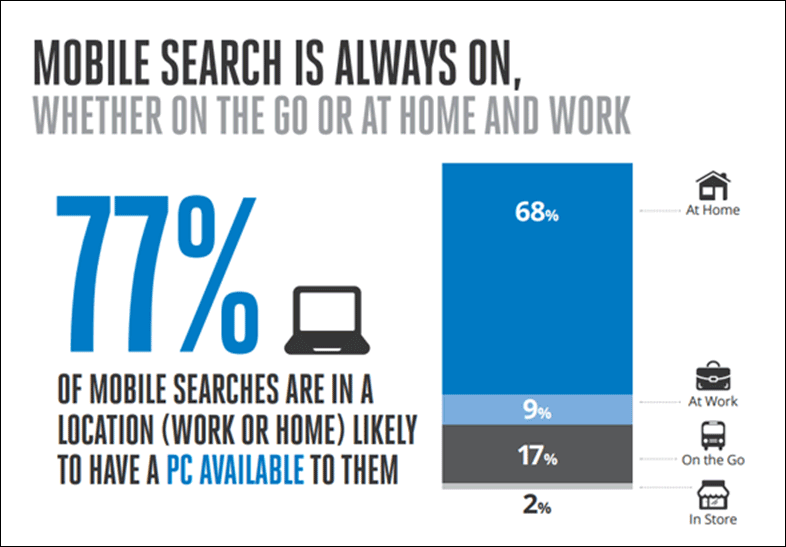
Most mobile searches occur with a desktop nearby. Many shoppers do the research on their phone, but then complete the order on the nearby desktop. [Source]
Well executed Cart Recovery email programs do just that! A mobile user browsing your site may add some items to their cart, but decide that checking out on a phone is too cumbersome, and take no further action. But your Cart Recovery email should enable them to click a button in the message from their desktop and go to a fully populated cart and complete their purchase in an environment they’re more comfortable with.
You’ve reduced your Cart Abandonment rate and closed a sale from a mobile customer!
Whether you’re now considering setting up a cart recovery email program, or you have one in place but want to make sure it’s as effective as it can be, incorporate the guidelines below into your campaigns to start reaping the rewards!
For Any Email the Subject Line is Key
The Subject line (and the pre-header) of any email is one of the most important factors, if not the most important, in whether the recipient opens the email. Many articles on the Internet will say that a Cart Recovery email should invoke certain emotions to combat what caused the user to abandon the order in the first place. But I think that’s making things more complicated than they need to be.
The fact that users tend to open Cart Recovery emails so much more often than regular marketing emails should be your first clue. People are inclined to open these messages so long as they know that’s what they are. The relationship is there—they’ve taken multiple steps with you already. So make the subject line clear and to the point. Let them know that this is their avenue to completing the order, and getting the items they so desire.
Sure, you can make your subject cute or funny if you want, but if that’s all it is, if it doesn’t get to the point by making sure the recipient knows it will get them to their cart so they can continue their order, you’ll probably suffer a little.
Target did this well in our tests. Their first message after our abandoned cart had the subject of “Your cart’s still here, check out now.” That’s direct & to the point. I know what it is, and I’m likely to open it. If you like a little humor, they took care of that in their next message: “Your cart called. It wants you back.” We still get the humor, but it’s also still clear what this message is going to do for me. (Notice that both subjects specifically included the words “your cart”.)
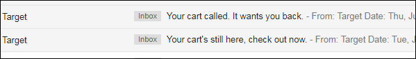
Both emails sent by Target made it readily clear what they were, and the second one used a little humor as an attention getter.
Unfortunately, I see too many that are quite vague or trying to be too cute, like this series from clothing retailer Revolve. The first message had a subject of “Oops, did you forget something?” The subject of the next message was “Need more time to think it over?”.
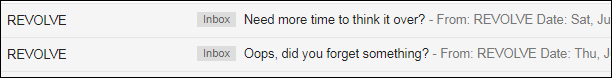
Messages from Revolve make the reader feel like they did something wrong, and are not clear that they’ll facilitate continuing the order.
Now first of all, I never like to say “Oops” to a customer, whether in an email, error message, or anywhere else. It makes it sound like the user made a mistake, like they messed something up. If you’re trying to convey emotions, shame is not the one you’re going for! At least they left that out of the second email, but even that subject is vague. It would be simple for that to get lost in the shuffle of other plain old marketing emails I receive.
So remember, make the subject line brief & to the point. Using the word “Cart”, or “Order” will also probably help clarify to the customer what the message is about.
Personalize It – You Have the Data!
We know that personalized emails tend to be more effective ones than those with no personalization at all. According to Aberdeen, emails that are personalized see an average click-through rate increase of 14%, and an average conversion rate increase of 10%. And unlike most of the people on your regular email list, you actually have some data around which to personalize your remarketing emails.
Clearly you know the email address associated with the order, so the customer has probably logged in or started a checkout process. So you most likely have their first name if nothing else. You of course know what they put in their cart. You may have access to their order history, geographic area, and more. People respond to personalized messages. So personalize this!
I purposely abandoned orders with several prominent retailers in order to get remarketing examples from them, and of the nine that did send me recovery emails, only one, Ikea, did much personalization at all. Joss & Main did include my name in the To: line, but no more. Ikea included my name in the Subject line (“Tom, you left items in your cart!”). They also included my name in the text of the message (“Hey Tom!…”).
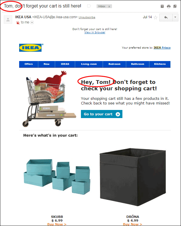
This message from Ikea was about the only example using personalization of all the companies I tried, and its use is minimal. Still, this is much better than nothing.
While this was better than any of the others, it was still, in my opinion, minimal. It’s true that they didn’t have much more than my name, so perhaps this is forgivable. But perhaps not. What are some other ways you can personalize your Cart Recovery emails? You probably know if I’m a returning customer or someone who has never ordered before. Take advantage of that! You know the size of my cart and whether or not I’ve qualified for free shipping, so you can use that to include text that can help persuade me. There are lots of things you can do with a little thought put into this.
Show What They Have In the Cart
Your customer added these items to their cart for a reason. They have some interest in them. There may have been a reason they didn’t finish the order, but deep down inside, they want those items. So show them! Sending a message that simply says that their cart is still waiting is a wasted opportunity. Show them the items in their cart, and the details of their order.
A cart recovery message without showing the actual products I put in my cart is a wasted opportunity.
There are two basic approaches to accomplish this, and I find that both are pretty effective. One approach makes the image of the product(s) the star of the email. If you go this route, you want to make the images nice and big relative to the rest of the message. Put products side-by-side to get more above the fold. Have just your basic details of each item with the picture: name, price, and options.
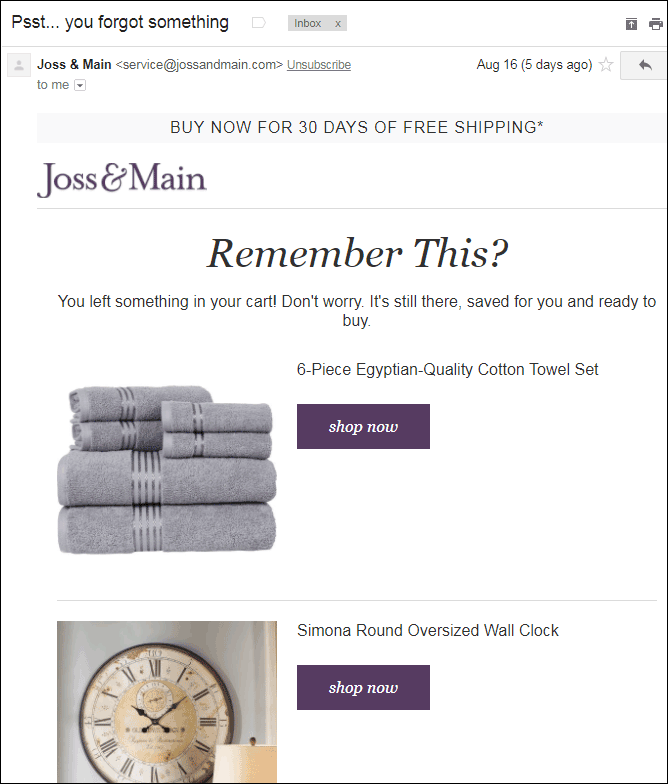
Joss & Main puts the focus on the product images in their cart abandonment emails. Doing so can help rekindle the desire for the product the customer had when they added it to their cart. Redesigning this to get the images side by side might be a better way to showcase the photos more prominently.
Both Joss & Main and Ikea used this method. In the Joss & Main example above, I’d recommend getting two products on the same line to get them both above the fold, and I’d also include the price. In the Ikea example shown earlier, the two products are indeed shown side-by-side, but a lot of vertical space is wasted with a stock shopping cart photo that probably adds little value and takes the focus away from the products. So I’d recommend removing that image.
An alternative format I’d recommend for this part of the message is to replicate the shopping cart as it appears on your website as closely as possible. This makes the entire Customer Experience consistent from website, to email, back to the website again. It triggers the memory of shopping and adding the items to the cart, and keeps the customer comfortable knowing that this is the order they remember.
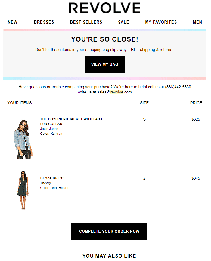
The email from Revolve shows the items in the order in a very similar format to the Cart page on their website. This helps keep the customer comfortable with what they’ve already experienced and can help ease them toward conversion.
In short, a consistent experience is a good experience!
Have a Strong Call To Action
Like everywhere else online, your Call To Action (CTA) is critical. And you want to follow the same guidelines here as you would on your site. Make it direct and active. Make it stand out visually. Offer it in multiple places if you can. And don’t distract with other, less important CTAs.
The Call To Actions in the Revolve email above are good. There is one at the top and at the bottom of the message. They are styled as buttons (which are naturally more clickable), and both have active, direct messages. The same goes for the message I received from Bobbi Brown Cosmetics. Again, there are CTAs at the top and next to each product, and both have good active text associated with them.
I will say that in terms of styling, they could stand out a bit more. The one at the top is styled like a Ghost Button, which in my opinion will lead to fewer clicks. Ghost buttons are a wasted opportunity to me. Or to quote the wonderful Angie Schottmuller, “Ghosted buttons have ghost conversions.” And the CTA at the bottom is just styled as a simple link, which would not stand out so well either. Styling both as a button that contrasts well with the rest of the message would be optimal.
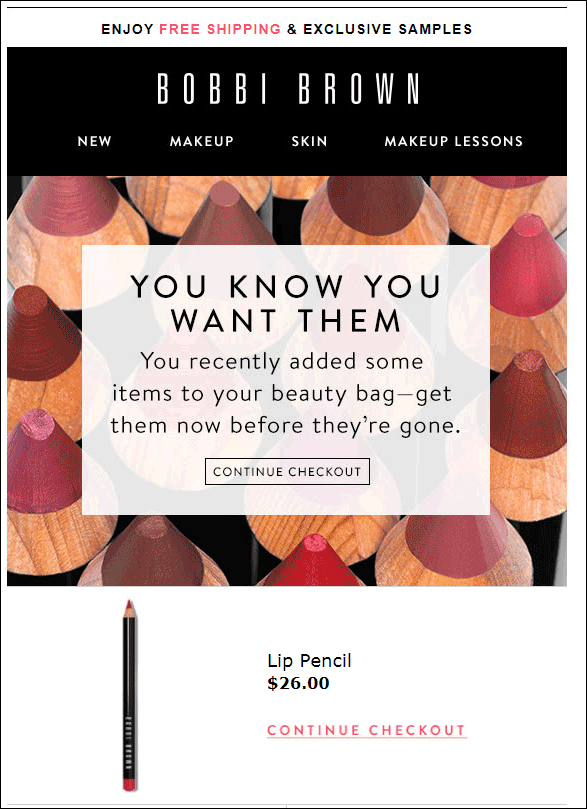
The text and double-placement of the Call To Action in this Bobbi Brown message are good. However, styled as a “ghost button” and a plain link result in neither standing out as well as they could.
The email from clothing retailer H&M below looks like it has a good Call To Action until closer inspection. It’s styled as a button that stands out pretty well, with good text (“Go To Shopping Bag”). But then right below it they inform us, “You might need to log in.” I’ll skip the diatribe about H&M requiring you to set up an account to shop with them (if you’re doing that, you need to fix it before worrying about remarketing emails).
But even if H&M has a very loyal group of users, telling them they “might need to log in” is just giving them a reason to put off going back and completing the order. That’s the very opposite of what you’re trying to achieve with this email!
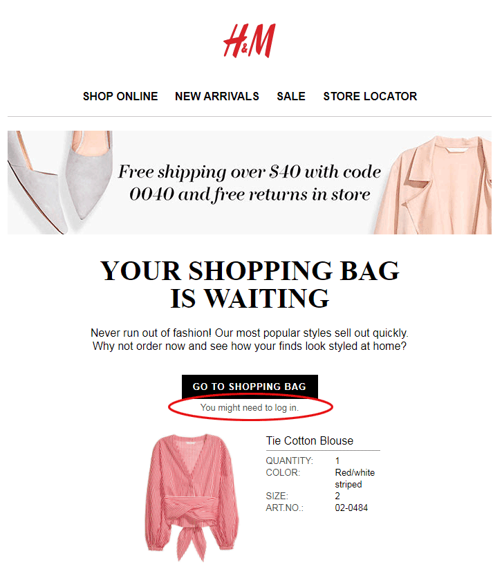
Don’t give users reasons to put off continuing their order like H&M does here by reminding them they’ll probably need to go find their password so they can log in. Better yet, don’t require them to log in at all to see their cart.
Make Sure Things Work Right Technically
It bears repeating: the point of a cart recovery email is not simply to remind your customer of their unfinished order, but to facilitate completing it. And remember, there’s a good chance that that continuity will occur on a new device. So by all means, make sure that the call to action in your email will always immediately take the user to a populated cart. That shouldn’t require a cookie. It shouldn’t require a login. It should simply take them to their cart right now, regardless of the device they use to click the link.
I was quite surprised at the high number of sites we tested that did not meet this basic requirement. Of the nine companies we received recovery emails from, only four actually took me to a populated cart if I clicked the link on a different device from where I had begun the order. One additional message took me to a populated cart if and only if I logged in first, but I consider this a fail. A few weeks later, regardless of device, 7 of the 9 companies had expired my cart with them.
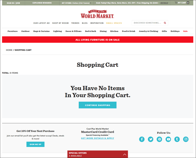
Clicking the “View My Cart” button in a World Market email works fine if I’m on the same device I was on when shopping originally. But if not, I am left with an empty cart and wondering why they didn’t keep their promise.
If your shopping system is purely cookie-driven, this will probably be a problem for you too. I urge you to correct it. If not, you’re leaving money on the table.
Worse is this example from Ikea. Instead of taking me to an Empty Cart page, it takes me to a page that makes things appear as though there are system problems. This “page cannot be found” response would stop many people from ever completing the order.
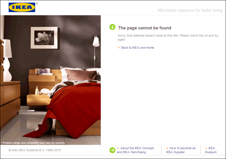
When clicking the “Go to your cart” link in the Ikea email on a different device (or after the cart has expired), we are taken to this page, which raises concerns about the site overall with the user.
Keep the Cart Active
If you’re trying to recover abandoned orders, it just doesn’t make sense to have those orders expire right away. Many shoppers are incredible procrastinators. Often they’re very early in the research phase of their purchase and are adding things to their cart purely to save them and compare before making a purchase later. If you’re trying to reduce your cart abandonment, it’s a good practice to make the cart persistent for a while.
How long you should keep a cart active will depend on a number of different things, especially your customers and the products you sell. But I’d say to keep them active for at least two weeks, and many experts suggest at least 30 days.
If someone starts an order and receives a cart recovery email the next day, they may open it then. They may even click through. But whether they do or not, many will let the email sit in their inbox for a few days until they’re ready to purchase. The last thing you want is for that customer to click the link, expecting to see their order, and find an empty, expired cart, even if they did it on the same device where they started the order.
I was surprised to find that of the nine companies that sent us recovery messages, seven of them had allowed the cart to expire when I clicked the links two weeks later.
Should You Sweeten the Deal?
When companies first started utilizing cart recovery emails, they often included a discount code as an enticement for the customer to complete the order. Often they would start with a gentle reminder an hour or so after the customer abandoned the order, and would follow it up with one or more emails a day or more later that would include the discount. Companies saw great results with this attempt to hack away at their abandonment rate.
Offering a discount in your recovery emails can give them a big boost, but can also train your customers to wait for the discount before completing all their orders.
However, this can create long-term problems in that soon, your customers will learn to abandon orders on purpose in hopes that you’ll provide them a discount carrot down the road. And true to form, none of the nine companies that sent us recovery emails used any type of a discount in them.
But there are other things you can do to entice customers on the fence to convert that don’t include giving them discounts. One is to create a sense of urgency. If there are products included in the order that are getting low in inventory, be sure to call that out that in the email. This will create an incentive for the customer to purchase before missing out on the items they want. If you offer nearby store pickup, as in the example below from Crate & Barrel, this can entice customers who want the item right away.
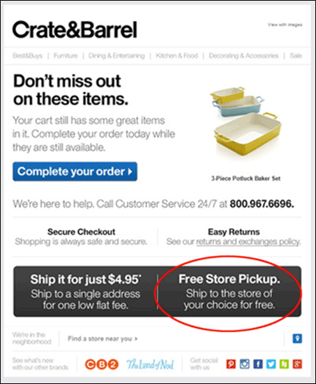
Crate & Barrel doesn’t offer a discount in their email, but they do a good job of communicating other benefits to the user for ordering, such as free in-store pickup, and easy returns.
One way of creating urgency I’m not a fan of is warning the customer that their cart will soon expire. Again, clearing out a cart on a customer benefits no one. Plus, warning your customer of a soon-to-expire cart creates a negative tone in an email, something you don’t want to do. Customer warnings are good things to avoid in promotional emails.
Go And Recover Those Abandoned Carts!
So there you have it. Depending on your shopping platform and your email service, you may or may not be able to implement all of these recommendations. And as with everything else, your mileage may vary. So test what you can to find out what works best for you.
If you have not yet implemented a recovery email campaign, this list will help you identify the best provider for you by finding out what capabilities they do and do not have. Use it to your full advantage. And please, leave a comment to share what has worked well for you so that others can benefit as well.


