When it comes to usability and how sites convert visitors into sales, we can often learn a lot from what other large, seemingly successful organizations are doing on their websites. In fact, it is surprising how often we can learn what not to do from even these companies.
Here is another in a series of poor usability examples we find from everyday usage on the web.
The AT&T Performing Arts Center
Located in our home of Dallas, Texas, the AT&T Performing Arts Center showcases a wide range of cultural events to the DFW Metroplex. My wife and I have seen a number of events there ourselves, and each performance has been top-notch.
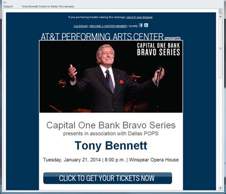
A few days ago, I received a promotional email from this organization, highlighting an upcoming concert by the great Tony Bennett. I’m unsure as to why I received this message, because while I have purchased tickets online before from this venue, I specifically opted out of future promotional emails.
At the same time, my wife and I are big fans of Tony Bennett. So the email did pique my curiosity. We have seen Mr. Bennett perform before, but I was curious about the price of tickets for this event so close to our home. Unfortunately, the email did not list any ticket prices. However, there was a big button on the email that read, “Click to get your tickets now”. So I figured I could click that to get to a page to see the ticket prices.
Still No Pricing
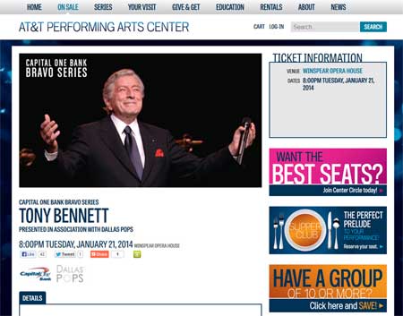
Clicking that button did take me to a page dedicated to the concert. It had the date, time, & location of the show (all also available from the original email). It gave me three long paragraphs about Tony Bennett’s life. But it did not say how much tickets cost. So I thought I’d have to actually begin an order just to see how much the tickets were. How inconvenient!
Looking to reduce your cart abandonment? Make sure all components of your pricing are listed up front. I don’t just mean your base price. But make things like shipping costs or handling fees visible up-front so people have a good idea of what they’ll be paying before they add something to their cart. Or worse, before they add it to the cart for the sole purpose of just learning what those costs are.

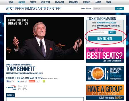
The landing page still did not show any ticket prices. Worse, the button to actually order tickets was nowhere to be found.
Funny thing was that this page didn’t have a button or a link to order the tickets! This wasn’t a page-loading issue because the page had fully loaded, and been up for over two minutes. I thought that perhaps some JavaScript was running and waiting on something, and that might have been the case. But I waited over five minutes and still got no button to order. I gave up. I figured I must have clicked the wrong link in the email, so I went back to it and this time made sure I clicked the “Get Your Tickets Now” button.
When I clicked that, I came to the same page as before. Disappointed, I looked one more time to see if I had at least missed the ticket pricing. Then about ten seconds later, voila! The “Buy Tickets” button magically appeared!

The next time I clicked on the link, a ticket ordering button did (eventually) appear. Still no pricing though.
Want more effective email campaigns? Be sure your server can handle the traffic to display the landing pages associated with your promotional emails. If your landing page doesn’t work, even if it is because a lot of traffic all at once, your customers will be much less likely to open or click-through from future emails you send out. Your unsubscribe rates are also likely to rise.
I did click the “Buy Tickets” button, but by now it was almost exclusively to see if I would ever get any ticket pricing. I had lost too much confidence in the system to actually make an order. What happened next was totally unexpected.
Placed On Hold—By A Website
I imagine most of you have purchased tickets to some event online before. I have many times, on several different platforms, but they’ve always functioned pretty much the same way. You are shown the different price levels, usually with a map of the venue, you choose a price level (or “best available”), and the number of tickets you want. Then the site normally displays a set of seats which you can choose to order or not. Normally, you have a time limit (for example 15 minutes) to complete your order before they go back into the available pool.
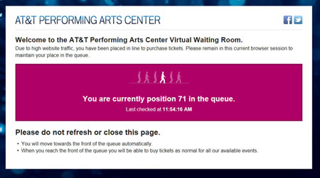
However, this time, the experience was completely different. Upon clicking the “Buy Tickets” button, I was taken to a screen that said I was 14th in line and would have to wait patiently for my turn to come up. The screen was quite specific that I should not leave that screen or refresh it. It had me thinking disastrous things would result if I did.

How long will you have to wait before you move up 71 places in the queue? Be sure not to close or refresh the page!
When implementing a process that is already done on several websites, use extreme caution when you get the urge to completely change the experience. Once users get used to a certain procedure, even small changes can be frustrating for them. Often, they have challenges even completing the task. If you’re going to try a radical approach to something, be sure to test it thoroughly with random test subjects and gage their responses to it.
I’ve always thought that the attraction of ordering tickets online is that you could skip the hassle of being put on hold, which happens when trying to order by phone. But this site was simply recreating that (negative) experience! I had no idea how long it would take to move from 14th to 1st. Since by now I had completely lost any interest in buying, I moved to close my window. But just before I did, the screen updated saying I was now 6th in line. Well, that was pretty quick, so I decided to wait.
Three minutes later, I was still in sixth. But by now I knew I had a blog post working, so I waited it out. And a little less than a minute later, the screen changed again. This time it simply said, “You are currently position in the queue.” I wasn’t sure if that was good or bad! But I saw that a new page was trying to load, so I was hopeful I was about to be next. (Why should you ever put a customer in a position that leaves them “hopeful” something good will happen?)
And Then Hung Up On
How many of you out there have been on hold for what seems like forever, and then just when you think you’re getting picked up by a person, the phone goes dead? Go ahead, raise your hands! I think we all have. Apparently the concept of replicating the “order by phone” process was a high priority by the AT&T Center, because they recreated the “hung up on” portion also. When that page I saw loading did eventually load, it was a blank page. Completely blank. I left it up for over 5 minutes to make sure. I had been hung up on after waiting patiently in my queue.
As I have already mentioned, by this point I was still playing their game mainly to see how much tickets were for this concert (which I was of course, unsuccessful at). But imagine if this was that one concert you had been dying to see. Think of how frustrated you’d be. How ticked off you’d be!
You would have to be pretty anxious to see that show to try it all again. In the name of research, I did dive back into the pool and found that this time, I was starting at 65th in the queue. I closed my window and went on to other tasks.
Want happy customers that come back and order over and over again? Make sure their experience is a positive one by testing your application completely before launching it. And certainly make sure it works well and your server can handle it before sending out an email driving thousands of visitors to a poor experience.
I suppose that if you are selling a limited number of tickets to a high-demand concert, you might be able to get away with creating a bad experience with your customers (although that can still hurt sales of future concerts significantly). But most of us don’t have that luxury. We are trying to sell as many items or gather as many leads as possible, and each unhappy would-be customer who went somewhere else is a major opportunity lost.
Perhaps the saddest part of this story is that identifying these issues could have been so easy. A half day of short tests with a service such as UserTesting.com could have easily identified most or all of this quickly and easily. As it turns out, there are some facets of the ordering process at the AT&T Center that are cool & unique, such as the ability to choose your exact seats out of all that are still available. The problem is that many people on that day couldn’t get far enough to be impressed with anything like that, and possibly won’t ever try again, for fear of being 71st in the queue (or much


