 There are still way too many of you out there. You know who you are. You read every day about how beneficial email marketing can be for you. You want to take advantage of it. However, you also read about so many things to consider, it’s been overwhelming. So you’re still sitting on the email marketing sidelines.
You’ve probably read about, and are therefore worried about things like getting through spam filters, making your email look good on mobile phones, the difficulty of getting the email to look right in a multitude of different email clients, low open rates, things like that.
Those are all valid concerns, but as daunting as they may seem, they shouldn’t stop you from getting started. After all, if only some of your email recipients see the email the way you intended, that’s still better than none. And besides, you can easily overcome most of these issues easily, without a sophisticated email campaign designed for you.
Here then, are my Getting Started guidelines for designing marketing emails which will appear nicely for the vast majority of your recipients. Once you get this mastered, which will be quickly, you can move on to more sophisticated techniques.
Philosophies to Keep in Mind
Before I go further, let me make clear that the above issues are indeed important. While I don’t want you to let them stop you from proceeding, we do need to keep them in mind when we’re developing your email message. So let’s talk about them a bit.
Email on Smartphones – We all know that mobile usage is exploding in general, but the thing is, that growth is even more dramatic in email. Regardless of your industry, go ahead and just assume that more than half of your email opens will be done on a phone. So we do want to plan for it. I’ll get into individual considerations for mobile viewing below, but the number one thing to keep in mind is to have the ability to send a test message to a mailbox that can be opened on a phone, so you can see how it will look there before you send to your entire group.
Responsive Design – As in Responsive Websites, Responsive Emails are messages that will show one way when viewed on a desktop computer, and another way when viewed on a mobile device (or any smaller screen). It’s a very hip, cool, and trendy design approach, and it is the future of web design. However, if you’re just getting started with your email campaign, just forget about Responsive Design. I know, I’ll be chided and pointed out for such backward-sounding advice, but the truth is that many email clients still do not support the @media queries required to make a message responsive, and it’s not the thing to tackle for your first campaign. Just keep mobile in mind for your design, and worry about a responsive design when you’re campaigns are more advanced (and technology catches up).
Different Email Clients – The term “Email Client” refers to the software you use to view an email. Microsoft Outlook is an email client. So is Google’s Gmail. When building a website, you have to worry about three or four different browsers. The problem with email is that there are dozens of email clients out there. And it seems that each has its own set of nuances. Outlook doesn’t show background images. Gmail doesn’t like CSS other than in-line. Because of things like these, it’s good to keep your code pretty straightforward, and to get a couple of test email accounts that can be used to test in Yahoo!, Gmail, Outlook, iPhones and Androids.
Spam and Open Rates – I’m lumping these together, and again, many experts might scoff at that. But many of the things that would trigger a spam mechanism would also cause a human not to open the message had it gotten through, and vice-versa. You’ll see that many of the guidelines I present below deal with getting more people to want to open your email.
Now that we have some of that covered, let’s dive into things to keep in mind for your first email marketing campaign.
Use an Email Service Provider (ESP)
I’ve often run into people who just plan on sending an email to a huge list of customers right from their own email client. There are so many reasons not to do it that way. For one thing, an email sent to a huge distribution is much more likely to be caught by a spam filter.
But beyond that, if you sign up for an inexpensive Email Service Provider (ESP), such as ConstantContact, iContact, MailChimp, or AWeber, they handle all of the difficult part of distributing the email. They can handle things like giving your clients the ability to unsubscribe easily, bounced emails, and other “housecleaning” issues associated with mailing to a large list. They also take great strides to ensure that their servers stay white-listed, increasing message deliverability.
Most ESPs also have easy to use email design software and a library of templates to help you get that look you want quickly.
Keep Your Messages to About 600 Pixels Wide.
Most email clients have two or more windows of their own, so the viewing area of an email is typically much narrower than that of a browser. A 600 pixel wide email is plenty of space to get your message across, and also will look easier to read for your recipients.
Don’t Design Your Email as One Big Graphic
And don’t just make it a set of smaller graphics all adjacent to each other either. Over 50% of all email users have images turned off as their default. So when they first open an email, or look at it in a preview pane, if your email is just one big graphic, they don’t see much of anything. There is little to entice them to actually download the images to truly read the email, other than the subject line.
It’s the same way if you slice that big image up into smaller ones. You users still don’t see much until images get turned on. Instead they see something that looks like a blank jigsaw puzzle—hardly an enticement to read further.

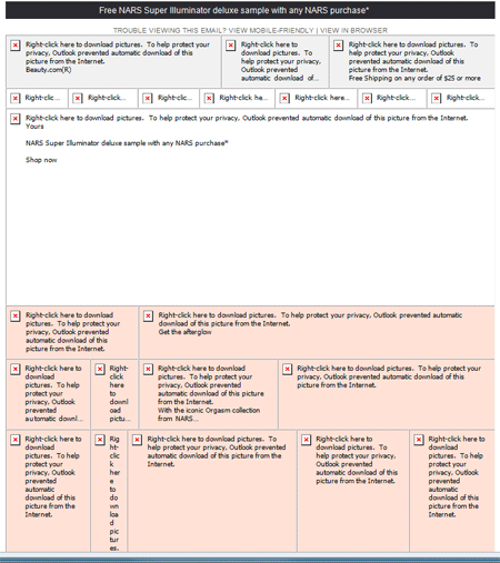
Here’s an example of how an image-heavy email looks before the user turns images on. This message actually does have a small amount of text in it, but it is so overwhelmed by all the blank graphics, that most readers probably didn’t see any of the text.
Instead include regular html text in the message, and up high where it will be seen. If there is any value to your recipients, that should come out by the first pieces of text in the message. This may mean you can’t use the font you want, but having your email a little less exquisite looking is better than not having it looked at at all.
Don’t Use Background Images
As of this writing, Microsoft Outlook’s support of background image is partial at best. More accurately, it’s unpredictable. With so many people using Outlook as their desktop email client, too many people will miss the background image if you use one. In most designs we’ve seen using background images, that background is a pretty crucial component, and if it doesn’t show, the email often doesn’t make sense.
Try to get your developer to code things up so that backgrounds are not needed. If there is no way to do that, I’d say to use them only if they are superfluous to the look of the message. If the message will still be effective without the background showing up, then it should be fine to use them. Otherwise, I’d suggest looking at a simpler design.
Make All CSS In-Line
For several years now, CSS has surpassed traditional basic HTML as the main vehicle for coding a design to be viewed in a browser. Typically, that’s done with an external CSS file, or CSS defined in the <head> section of the document. That’s great for a browser, but for many email clients, CSS is only supported in “style” attributes of html tags (known as “in-line” CSS). Gmail is one such client, and you likely have many of your recipients using that.
So instead of
<head>
 <style type="text/css">
 .maintext {font-family:arial,sans-serif;font-size:18px;color:#3F3F3F;}
 </style>
 </head>
 <body>
 <span>Information to Help You</span>
You’ll want:
 <body>
 <span style=" font-family:arial,sans-serif;font-size:18px;color:#3F3F3F;}">
 Information to Help You
 </span>
Use CSS as Little as Possible
If changing your html to put all your CSS in-line is a pain, perhaps that is good. Because beyond simple text styling, consistent support of many other CSS commands is again limited across all email clients. Very common CSS markup such as border, padding, margin, and list-style are not supported in all email clients—not even among the most heavily used.
The web design high-hats might ridicule me again here, but try coding your emails as if it were 1999. Consider using tables instead of positioned divs. Use a combination of small graphics and table cells with precisely defined widths and heights to position elements of your message. It’s old school to be sure, but it will help you get more consistent support across most major email clients.
Keep the Total Size of Images As Small As Possible
I said above not to make your email just a bunch of graphics, and another reason is that with so many people viewing emails on phones, more graphics take more time to download. If it takes too long to download, many people will stop and move to the next one. Some also have data plans which limit the amount of data they can download, so they’ll be upset if you force them to download a bunch of large files.
Even though you’ve changed some of your message from image to text, you still want to look at each image you are still using and its file size. Use Photoshop or one of many free online image compressors to reduce the size of the images in your email.
Think About Your Very First Line Of Text
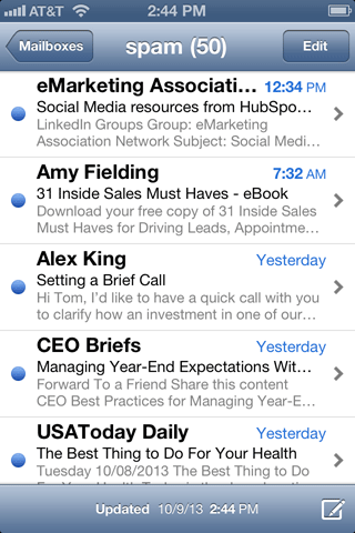
In most mobile email clients, when looking at the Inbox view that shows several messages together, you typically see the Sender, the Subject, and also a small snippet of the first line or so of text in the email. This first line can be crucial in determining whether your message gets opened or not.

On most smartphones (and many desktop email clients), the mailbox view shows not only the sender and the subject line, but the first line or two of text that appears in the email. What that first piece of text says will go a long way toward getting someone to open the message or not (apologies for the screen cap of my spam folder).
An emerging best practice is to include a simple line of text at the very top of your message—above your logo or whatever you’d typically think of as the top of your message. You want this line of text to be enticing enough to increase the likelihood of your reader opening it. It can complement the subject line, but it should not just be a repeat of it (both this line and the subject line are visible in the Inbox view). If your subject line is something like “Special Offers for October”, your lead line could be something like “Save 20% on our newest products through Oct. 15”.
I’d wager that the most common first-line of text across all emails would be something like “Having troubles reading this message? Click here to open in your browser”. That might still be a good piece of text to have toward the top of your message, but if it’s the very first piece of text, it’s not going to entice anyone to open the message. Put your new lead line of text above it.
Mimic the Look & Feel of Your Website
In most cases, you’re sending a promotional email because you want your reader to come to your site and take an action. For example, if you’re an online store, you want them to come to your site and make a purchase. If you are a politician running for office, you want them to come to your site and do something like donate money, request a yard sign, or volunteer.
Assuming your email was enticing enough to open and click through, you’ll find that a greater number of people will take the desired action on your site if you have provided them a consistent experience from email to website. Use the same or similar layout as your site has. You may not want the same navigation as is on your site, but you might do well to have one or two key links in the same location of the message as where your navigation is on your website. Certainly you want the landing page to echo the offer that is discussed in the email.
Tag Your Links for Analytics
You’re almost wasting your time if you put effort into an email campaign and can’t measure its success. All links to your website within your email should be properly tagged so you can measure its effectiveness in your analytics program. All ESPs will have some basic reporting features such as telling you what percentage opened, clicked, etc. But few will be able to tell you how many actually converted by doing the action you’re hoping for. You may know that 100 people clicked through, but how many purchased?
Tag your links so you can track things like how many people purchased. If you use Google Analytics, you can learn all about Campaign Tagging here. It’s simple, and extremely important.
Now Go Market Your Website!
Put together a basic design for an email that looks a lot like your website and has a compelling offer for your customers. Get it coded up in html that is as basic as possible and avoids background images and external CSS. Sign up with an inexpensive ESP and send the message to yourself and at least one Gmail mailbox, one Yahoo! mailbox, and someone who reads email in Outlook and on an iPhone. Make sure it looks okay in each of those clients, and if not, tweak it so that it does.
Now go send it out to your opt-in list and track the results!


