The explosive growth of mobile usage for Internet-related activities continues, and nowhere is it more prevalent than in reading email. According to Litmus, more than half of all email reads take place on a mobile device. How do your company’s emails look and perform on a phone or a tablet?
This is the 3rd in a series of blog posts looking at what some of the major e-marketers out there are doing when it comes to email marketing. Who does things well? Who does not? (For more, see my first two posts reviewing the email sign-up process and email marketing best practices.)
Just like before, please be aware that just because a big player is doing something, that doesn’t mean it is a good or bad practice. We can look at their emails, but we can’t see their results. A company such as Office Depot can break a so-called best practice, but it’s very possible that they have tested that and made an informed decision to do it. Likewise, just because a company appears to be doing everything right doesn’t mean they are seeing the results they are hoping for.
So these are just examples. Your mileage may vary. And you should always test significant changes to your messages. (Transparency: none of the companies mentioned below are Web Site Optimizers customers.)
Responsive Design
It’s the Holy Grail in terms of any kind of web design right now, so let’s start there! The biggest challenge in sending out responsive emails is that some clients, such as Gmail, do not support the @Media CSS instructive. So in those clients, the email will revert back to its default state, which usually means a shrunk down view of the email as designed for desktop.
So who is sending out truly responsive emails, and how is that working out? We collected emails from 22 large brands who are actively emailing promotional materials to find out. And the biggest take away was that very few of them are doing anything at all with Responsive Design.
Three excellent examples of those that are using RWD for their emails came from retailers H & M, Target and Nordstrom. In all three cases, for clients that accept @Media statements, the links & buttons are easy to tap, the text is sharp and the photos are full. They look the way retail emails are meant to look on a phone.
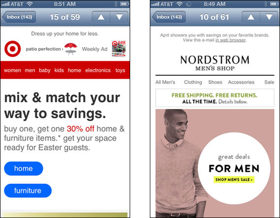
Responsive emails from Target (left) and Nordstrom (right) viewed on an iPhone. Click to see more contents of each email.
However, in Gmail, each become just shrunk versions of the desktop version of the email, with text that is difficult to read, and buttons & links that are nearly impossible to tap.
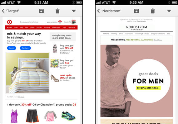
In Gmail, and other clients that do not recognize @Media in the CSS, the emails of Target & Nordstrom revert back to their “desktop” version. The text becomes smaller & more difficult to read, and the links, especially on the Nordstrom email, become very difficult to tap.
Even if your message will be responsive, because some email clients do not support @Media, it is important to still design the desktop version “for mobile first” so that if the message is forced to show the desktop version on a mobile device, it will still be useable. We get into some of that below.
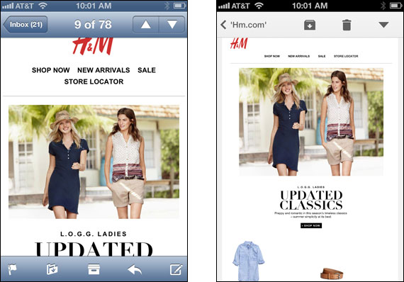
H & M sends out messages that are beautiful on phones when the email client interperts @Media directives (left). But in clients like Gmail (right), they don’t come out as well.
Non-Responsive Emails
The vast majority of companies we reviewed sent out emails that were not responsive. And as you might guess, most worked pretty poorly when viewed on a smartphone. But that doesn’t necessarily have to be the case, and several of the businesses we sampled prove it. There are some basic guidelines to keep in mind when designing your messages for mobile first.
Perhaps the biggest problem with emails on smartphones is that the phone just “shrinks” the message to fit its viewport. This typically makes text much too small to read, and links way too small to tap. Most smartphones will adjust the text size so that it is effectively “grown” after the entire message is shrunk, so that it can be legible (which can lead to problems of its own, see below), but more often than not, the major retailers are incorporating the text within their graphics, so everything shrinks and the text is too small to read.
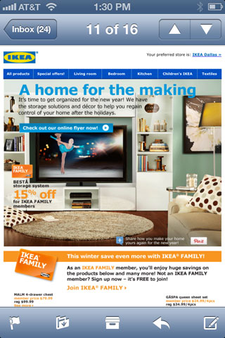
Emails from Ikea look pretty good on a desktop, but when viewed on a smartphone such as the iPhone, you can barely read any of the text. The links up in the nav and elsewhere are so small that they are very difficult to tap accurately.
A way around this is to let the photos do the talking in your emails. Minimizing the text in your graphics allows you to make that text larger, so that if the email is shrunk to fit a small viewport, the text is still legible.
Similarly, while it’s great to have a nav bar that mimics your website, that can be problematic if it is shrunk to the point where people can’t tap any of the links. But if you provide an abridged nav with fewer links such that when shrunk they can still be tapped easily, you’ve fixed the problem.
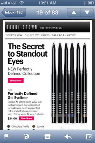
Most emails from Bobbi Brown implement a lot of this. Their nav bar is shortened to just three choices in their emails. While it is fairly short vertically, the choices are wide enough that they are pretty easy to tap, as are the “Shop now” buttons. And while some of the detailed text is pretty small on a phone, there are headlines and subheads that are still plenty large enough to read easily.
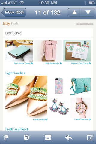
Etsy takes a different route in solving this problem. They really let the photos do the talking. The text in their emails is still rather small, but it is minimal. The product images are the star here, so it’s a positive experience opening an Etsy email. There is no nav at all in these messages, but the photos are large enough to click easily.
Avoid These Mistakes
There are several things that you can overlook when designing your email that will make for a less than optimal experience when viewed on a smartphone. The best way to combat these is to test, test, test. Open your messages in every kind of email client you can get your hands on—especially mobile clients. Do this both with test versions, and the actual versions you send out. When you see something that doesn’t look right, get it fixed for your next message!
Text Growth
As discussed above, smartphones often enlarge text after the message has been shrunk so that the text is legible. However, this can often throw different things off. If you have a tightly defined table that requires each cell to be a specific height, a cell with text that gets enlarged will likely increase the height of that cell (and therefore the entire row). This can throw off your layout if the neighboring cells have images that rely on a specific size for the cell.

Since the iPhone enlarges the text in this email from Central Market, the vertical height of the cell that holds it is increased. But the images all around that cell expect it to be a distinct size–always. Because the height of that cell has increased, the images around it do not match up, causing the email to look broken.
Another problem with adjusting the size of the text is that if the line-height is specified, it does not get adjusted accordingly. That can result in lines of text running into each other. In the example below, this occurs for BabiesRUs, both at the top of the message above the fold, and with a lot of text at the bottom. As all of this text contains links, the problem is even magnified.
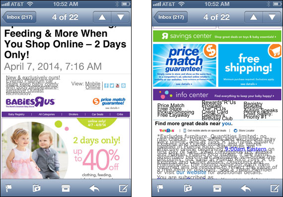
The text has been enlarged in this email from BabiesRUs, but the line-height had been specified and it does not get changed by the phone. This causes too little space between lines vertically, making it hard to read.
Long Subject Lines
Many people have many theories about subject lines, and how they influence your opens and click-throughs. But here is something you don’t hear much about. Long email subject lines can push the actual content of your message pretty far down the page on a smartphone. Subject lines are indeed important for enticing the recipient to open, but rarely can they carry the message. If your reader doesn’t see content worth exploring when the message is opened, there’s a good chance they will not scroll down to look for it.
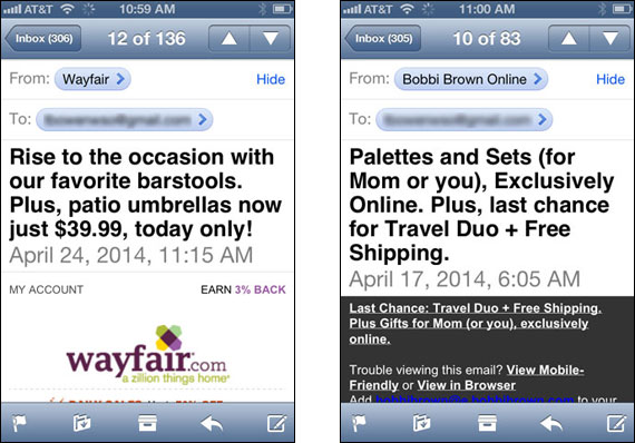
The subject line for the email from Wayfair on the left is so long that there is only room left for the Wayfair logo. Users don’t see any content without scrolling. The problem is even worse in the message on the right from Bobbi Brown. The subject plus some heading text takes up so much room, there isn’t even room for the brand.
Messages That Are Too Long Or Heavy
By their very nature, email messages are designed to be reasonably short and simple. Regardless of platform, people do not open an email expecting or wanting to find a whitepaper or an epistle. They are messages, not letters. Our mindset to email makes for very short attention spans. So you always want to be mindful about the size of a promotional email.
This concern is greatly amplified when that message is being opened on a phone. When using a phone in general, the user’s attention span is even shorter. But also, the user often has limits to the amount of data they can download. Sending a long message full of photos and several offers eats into those data limits. Photos that are larger file sizes than necessary require a lot more time to download, and users become impatient and click away.
We randomly sampled three messages from the past month for each of the companies we reviewed, and the range in terms of total data download requirements was quite large. Some averaged near or even greater than one megabyte per message. Etsy’s were the largest, averaging about 1.3Mb per message! This came mainly from the fact that they averaged over 27 product photos per message, most of which were much larger in file size than they needed to be (for example, a small280 x 280 photo of a terrarium was 68k—it could easily have been a third of that.)
Others sending large emails on average included Crate & Barrel (nearly 1.2Mb per sampled message), Wayfair (990kb average), and JCPenney (813kb average).
Some companies clearly care about your data downloads, however. Nine of the companies we researched averaged less than 300Kb in total data requirements per message. Office Depot was one of them, averaging only 190Kb. And the Indianapolis Colts Pro Shop online store had the smallest messages of all, averaging only 155Kb per message.
Partial Downloads
Another drawback to sending too large of a message is that many email clients will only download an initial chunk of the message in order to speed up the load. The user is prompted at the bottom of the downloaded portion to click a button to retrieve the remainder of the message.
This can create a few different problems for you as a marketer. Aside from the fact it might just annoy a few readers, it can often result in the recipient not realizing there is more to the message. They might not be interested in what was downloaded, but the content that was not downloaded might be the thing that causes them to click through and purchase.
Also, you can run into situations where because certain elements of the message were not downloaded, the entire layout of the message might be thrown off, as in the case of this message from JCPenney.

Partially downloaded email from JCPenney (note the “Download entire message” button at the bottom). Because the entire message was not downloaded, sliced graphics did not line up properly.
Tablets
Most of my talk here has centered on smartphones, but we all know tablets are mobile devices too! From an email perspective however, because the screen size is so large on a typical tablet, most of the considerations to be on the lookout for are consistent with desktop messages. However, one area that is still different between tablet & desktop is the clickable/tappable range for buttons and links. While you can have a pretty small target to click accurately with a mouse, that’s not the same with your finger on a tablet.
If your email has a lot of text links that are close together, that could be a problem on a tablet. If you have small buttons that are lined up next to each other, it can again be a problem.
American Apparel emails have a small nav section at the upper-right of their emails. While I’d hardly consider their emails to be Responsive, they are technically in that they use an @Media directive to suppress that nav when viewed on a smartphone. However, it is present when viewed on my iPad. Yet the links there are much too small to be certain of accurate tapping.

When viewed on an iPad, the tiny navigation links in the upper-right are much too small to tap easily.
Often, the best way to optimize your own campaigns is to look at what some of the other major players are doing and determining what to emulate, and what to improve upon. The companies mentioned in this post are all major brands with enviable revenue streams. They do a lot of things very well, yet there are still a few opportunities for improvement.
Now take this information and go look at other online retailers in and out of your industry. And go and craft the best email marketing campaign you can!


