For almost every client I’ve ever worked with, Email Marketing has been one of the top, generally the very top, performer of any online marketing effort undertaken. But because of this, too many people simply take a “Send it and they will come” approach to their email marketing.
That’s too bad because there are some simple things you can do (or avoid) which can make a major impact on the results of a campaign. I’ve written before about practices you can adopt to try to improve the open rates, click through rates, and conversions for your email campaigns. But how do the big players do with regard to these practices?
In December, we signed up for email promotions from 26 large online marketers, in a wide range of industries (read part 1 in this series on analyzing the sign-up process for those companies). Since then, we’ve been collecting emails from most of them (some have yet to send us one!). Now that we have six or seven hundred to review, let’s see which e-tailers are following these generally accepted guidelines, and which are doing things a little differently.
But before starting, I want to clear up a couple things. First, none of the companies I mention in this post are or have ever been customers of Web Site Optimizers. Second, and more importantly, these are observations of email implementations, not results. Just because someone is following a best practice does not mean that it is paying off for them. Without access to their metrics we cannot know. Likewise, a company might be violating an important “rule” but be doing just fine that way. They might have even tested and found that they are better off doing it that way. Each situation is different, and you should test your own hypotheses before drawing any conclusions for yourself. Now let’s get started.
Text Versus Graphics
I have always been a very strong proponent of including as much true text in your message as possible. By “true text” I mean html text, not a graphic that has a bunch of text imbedded in it. The temptation is strong to make your entire email a collection of graphics—many companies do it. That kind of implementation pretty much assures you that the email will look just the way you want it to on all email clients. You have no worries about fonts, letter sizes, etc.
The problem is that in so many cases, users have their email client set to not download graphics by default. The user must click something to tell their email software to download images for any email. Because of this, if your message is all graphics, there is nothing other than the subject line to entice the user to actually open the message and download the images. We generally see higher open rates when messages have a good mix of true text and graphics.
So how many of the companies we studied do this? Surprisingly, very few. Only two or three did what I consider to be a good job at this. Target does an excellent job. Their emails are generally laid out such that nearly all the text is visible whether images have downloaded or not. Yet the fully-downloaded version still looks enticing.
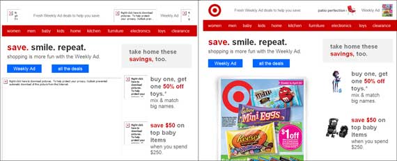
Left: a sample email from Target viewed in Outlook with images turned off. Right: the same email with images turned on. A good portion of the key information is communicated in the version on the left, hopefully enticing the reader to click to open images.
Central Market also did an excellent job at incorporating true text. The only drawback here was that because they used border images to match the look & feel of their website (a very good thing, see below), when not downloaded, those areas tend to distract your attention away from the text. But still, Central Market’s implementation is far better than anyone else’s we looked at other than Target, from a true-text perspective.
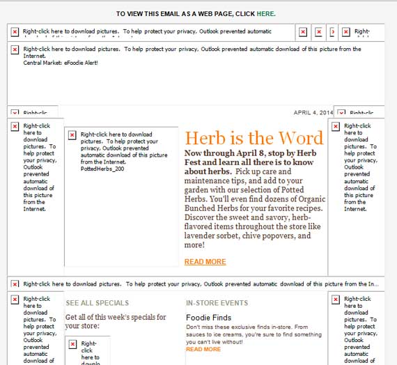
Email from Central Market, viewed in Outlook with images turned off. They still communicate a good deal of the value proposition of the email. The non-viewable graphics surrounding the text create enough distraction that somewhat less noticeable, however.
Sadly, of the 24 companies that sent us more than one email after signing up, 18 of them had no text (other than the “first line” text, see next section) in the body. Most at least used ALT text in most of the images, although this does not stand out when scanning a message.
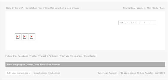
When viewed in a client such as Outlook with images turned off, this email from American Apparel displays no text that would entice the user to open it, aside from one small line of text at the very top and a small nav bar at right.
First Line of Text
More and more email clients are showing the first couple lines of text of an email in their Inbox view. So even if a user does not have their Preview Pane turned on, this view generally allows them to get an idea of what the email is about beyond the subject line. Indeed, while so much attention is paid to the subject line of an email, the first several words are now becoming equally important in terms of enticing the user to open the message.
Most companies know this, but we still often see instances where the first line of text is something like “View html version” or “Add us to your address book”. Seeing this in your inbox view will not entice you to open the message. Instead, the text should ideally compliment the subject line so that the combination makes the reader want to open the message and explore it further.
The best way to do this is to have some text at the very top of your email, so that it is indeed the first html text in the code. But ideally, that text would work with the rest of the message too, so that you are not tempted to stick it out of the way or try to hide it (see below).
Again, Target did an excellent job with this. Their text sits right next to their logo, and tends to sum up the content of the email well in most cases we looked at. If I had to criticize, I’d just say that their “first line” was often too similar to the subject line instead of being more complimentary. For example, in the illustration above, the subject line is “Your new Weekly Ad is ready + great store coupons” and the first line of text, “Fresh Weekly Ad deals to help you save”. Seeing those together in the inbox view is a bit of a waste as the one essentially repeats the other.
As far as having good “first line” text that complimented the subject, H&M had a lot of good examples. In some cases, the first line was a little short, bringing “View online” and the navigation into view, but the first line was consistently a good continuation of what the subject line began.
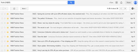
Several H&M emails in the inbox. The first line of html text consistently compliments the subject line to add extra reason to open the message. For example, on the April 17 message, the subject line is “Spring into summer with up to 50% off select styles, this weekend only”, and the first line of text is “Plus, free shipping on all orders over $50” Click to enlarge.
Almost all the companies we studied incorporated the principle of at least having a decent lead first line of text. Grocer Trader Joe’s was the only one that did not. And really, American Apparel falls into that category as well. They had the same first line of text in every single email (“Made in the USA—Sweatshop Free”).
One slightly disturbing trend we saw from a few companies was a decision to try to hide the first line of text, either by putting it in white color against a white background, or even by trying to set a style to display:none. This way it shows up in the Inbox view, but not when viewing the actual message. Central Market, Barnes & Noble and Crate & Barrel all did this.
I don’t like this approach because it seems a bit spammy, like they are trying to put one over on the reader. Search engines are not coming into play here, but I feel the SEO principle applies that if your text isn’t good enough for a human to read, it probably shouldn’t be in the email at all.
Look & Feel Consistent With Website
We feel that it is generally a good practice to have the look and feel of your email be similar to that of your website, so that your users have a fairly consistent experience when they click through to the site from the email. This is especially beneficial for ecommerce sites as it will help promote the conversion of an order.
We looked at components such as the treatment and placement of the logo, the presentation of the navigation, how consistent the nav choices in the email were with the choices on the website, the backgrounds, footers, etc. Generally, the more consistent all that is from email to website, the better chance the user will have of converting.
Most of the companies we looked at did this fairly well. Major retailers JCPenney & Macys did it exceptionally well, having nearly identical layouts for both email and website. In many cases, there would be only minor differences, such as using a serif font in email and a sans-serif font on the site, different locations or orientations of the logo, different backgrounds for the nav bar, etc.
In almost all cases, the experience was still similar at worst. But a couple differed to a greater degree. The emails from Etsy feature the grid layout of photos used on their website, but the logo is treated much differently in the email than the website, and the text is in different fonts and colors.
Trader Joe’s differed even more. The logo, background, text style, navigation, and more are all markedly different from email to website. About the only consistency is the very unique and cool style of the illustrations that is the same in both. Trader Joe’s can probably get away with this a little more easily, since they are not looking for people to make a purchase from the website, but their site may engage email readers a little better if the emails looked more like the website.
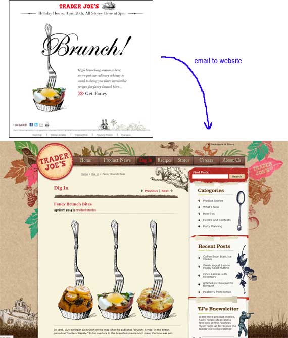
The emails sent out by Trader Joe’s (top) have a very different look & feel than their website (below). The biggest consistency is the style of art. Other elements are similar at best. The user experience from email to website is not very consistent.
Other Considerations
There are other things to keep in mind when planning out an email marketing campaign that don’t manifest themselves so much in the layout, or how things appear in different clients. And it is harder to determine if they are done “well” or not. I’m hoping that in the case of all the companies we looked at, each has tested different implementations of the following variables and has already arrived at which is optimal for them. But they are still worth reviewing.
Frequency of Sends
This is always a hearty topic for discussion at just about any organization. How often is too often, and what is not enough. More than anything else, the only way to discern what seems to be an optimal frequency is to test at various frequencies and see how they affect things like your open rate, click-through rate, conversion rate, revenue per email, unsubscribe rate, and complaint rate.
Of the 26 companies we looked at, we saw a wide range of frequencies. We looked at the number of messages we received from each company in the last 30 days. We received the most, 39, from The Gap. Of the 21 that did send us at least one message, the average was about 16 over the last 30 days. The median was 17 (Staples).
There were five companies that did not send us any emails in the last 30 days. Macy’s and Williams Sonoma did send us “Welcome” emails immediately after we signed up, but sent us no more. Pei Wei and Victoria’s Secret never sent us a single message. Maggiano‘s sent us emails regulary (six emails in February), but stopped sending to us on March 14, after sending us three that month. (It’s very possible that Maggiano’s stopped sending to us because we were not opening their emails.)
Segmentation
If you are not using segmentation in every facet of your digital marketing, you’re a few years behind your competition. Whether it’s analytics, A/B testing, personalizing your user experience, or especially email marketing, segmentation is one of the keys to good decisions and improved profits.
It’s very difficult to determine, simply from receiving emails, which of the companies we were studying was using any segmentation in their email marketing to us. Still, we were able to make a few observations.
Upon signing up with Macy’s, I received a Welcome email. As I said above, this was the only email I received from them. But for that one email I did receive, it included a map of the nearest Macy’s store to me. (This map was viewable in Outlook and on my iPhone, but not in Gmail.) Personalizations such as this can go a long way to converting as well as driving offline sales.
When I signed up for emails from Nordstrom, they asked some questions about which things I was interested in, and I chose the Men’s Shop. Because of this, all of the emails I have received from them have had to do with Men’s Wear.
None of the companies we reviewed used a personalized salutation (“Dear Tom” or something similar to that) in their emails.
Width
Okay, this one actually is a visual thing, so it could have been included in the section above, but it’s plain and boring enough that it seemed to fit down here. It’s really more of a numbers thing than one to show a bunch of examples of.
We received at least one message from 24 of the 26 companies we signed up with. And I was a little surprised at what I learned. The biggest takeaway is that messages are generally wider than I expected. The number I most often hear tossed out for an “ideal” width of an email is 600 pixels. However, of the 24 companies we looked at, only 9 were at 600 pixels or less (makeup company Bobbi Brown had the most narrow at just 510 pixels wide).
The average and the median width were both around 648 pixels wide, and I count 6 companies that have messages 700 pixels wide or wider. The widest of them all came from The Gap, who had messages 828 wide.
So perhaps 600 is not such a “golden” width anymore. If you can fit your messages within that space and have a quality presentation, by all means do that. But if certain components of your message are making you want to go up to as much as 700 pixels wide, it looks like that is probably not going to affect you too much. This makes sense as more and more people have wider monitors these days.
Coming Up Next
So that’s a quick overview of what some large online marketers are doing in terms of their email programs. If it interests you, I’d encourage you to sign up for emails from your competitors and other organizations in your industry (and other industries). You can learn a lot about what others are doing, and also get some ideas, both for creative and execution.
Be sure to read part 3 of this series, looking at how the emails from these companies do in mobile environments.


