 It seems that when looking at the Usability and Convertibility of an online store, most of the talk centers around the same places: the product detail page, the checkout process, cart abandonment, site search. Sometimes I think the Product Category Page is the forgotten stepchild of the ecommerce world.
Don’t overlook making your Product Category pages as effective as possible. Often, these are the pages where your customers will make the decision on whether to look closely at some products, or to move on to another store. So they can fill a critical role. They also offer wonderful SEO opportunities, especially since many people search on broader search terms that can apply more relevantly to a category page than to a specific product’s detail page.
Let’s dissect the anatomy of a good Product Category Page a little more closely, and consider how you can make it easier to use for your customers and increase their likelihood of purchasing.
Design Layout
For most stores, each Category page will be laid out the same way. Most ecommerce platforms will pretty much require that. However, if your product offering is broad enough that one or more categories would benefit from a unique design layout, by all means explore that possibility. But in all designs, try to make sure of the following guidelines.
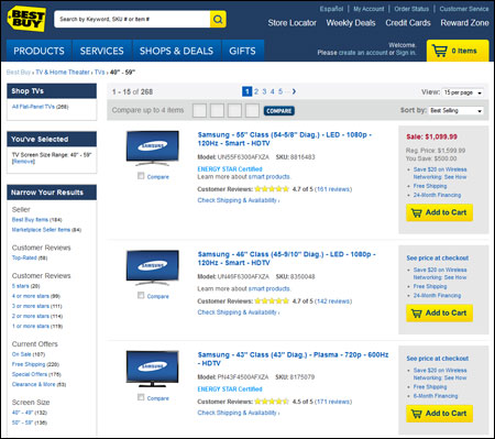
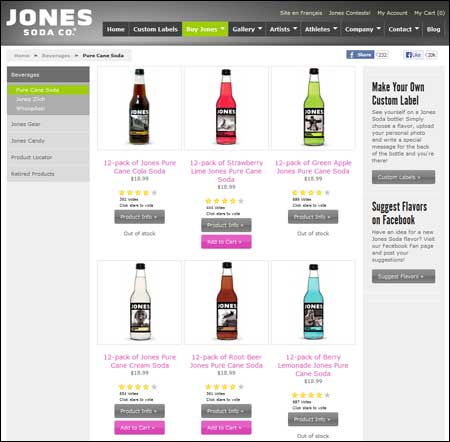
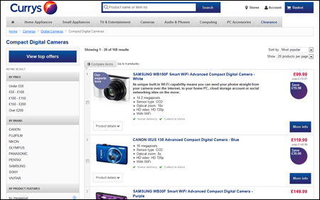
- Choose either a “column” or a “list” layout. The tradeoff is pretty simple here. With a column-based layout, you get more products in one screen, meaning also more above the fold. But with a list layout, you can show more information for each product.Make this decision based on what your customers will require to differentiate between products so that they can make the best choice quickly. If it only takes a photo and some basic information, use a column layout so they can see more products quickly. If there is more information required, then a list layout will probably work better.
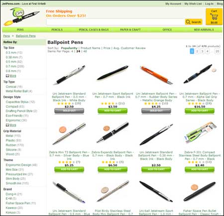
- Keep the number of products manageable. And by manageable I mean for your shoppers, not for you. When shoppers are overwhelmed by choices they have a more difficult time making anychoice.Checkout the Ballpoint Pens category page from JetPens.com. As of this writing, there are 470 different options, and most look pretty similar to me. How do you choose? If your store is like this one, you might want to consider a Filtering tool or a Product Wizard to help narrow the list before they get here (see below).
- Try to limit the number of pages to three or less. In most usability studies we’ve conducted, users rarely go past the third page. Either they choose something on the first couple pages or they tend to give up. If your category of products is returning more than three pages worth of products, you should consider splitting things up into more specific categories.
Components of Each Product Listing on the Page
Look at how each individual product is represented on your Category Page. How many of the following components of a listing are you showing your customers?
- Show Each Product’s Availability. If a product is out of stock, say so right here on the Category Page. Don’t make the user click through to it to see that it is not currently available. If it is out of stock, disable any “Add to Cart” button that might be on the page as well. But do allow the user to still click through to the Detail page so that they can learn more about it if they want, and optionally add it to a wish list or something like that.
- Show User Ratings. If you’re not collecting and displaying user ratings & reviews on your Product Detail pages, you really need to immediately. And a summary of those ratings, such as the average number of “stars” the product has been given by your customers, should definitely be visible for each product on the Category Page. This can certainly help customers choose which products to explore first and give them confidence going into the process.
- Include an Add To Cart button When Possible. In some cases this is not possible because the customer must choose product options such as size, color, inscription, etc., but if there are no choices needed, encourage the customer to add to the cart right from the Category Page. This may only save one click in the purchase process, but it can make for a better experience for some of your shoppers, and good experiences lead to repeat customers. Besides, if a customer is ready to buy, give them the opportunity before a distraction comes up!
Product Images
This seems pretty straightforward, doesn’t it? Hold on, it’s not necessarily! Be sure to consider these points about the product photos used on your Category Pages.
- Make Sure Your Product Photos Allow Customers to Differentiate Products Easily. The objective of the product image on the Category Page is not to provide fine details of the product. Your customers will look for those answers on the Detail page. What you want is to make it easy for them to discern which products are most relevant to their needs.The photo could highlight a differentiating characteristic of the product. Or if you use a particular photo in offline advertising, using that same photo here would be a good idea. But if each photo looks very similar (see the JetPens screenshot above), you’re making things harder on your users.
- Optimize Product Images for Size. On many sites, the photo used on the Category Page is the exact same image used on the detail page, just scaled down to a smaller size via the browser. This simply downloads much more data than necessary for each picture. You should have a resized photo in a separate file on the server that is used for your Category Page, and you can sacrifice a small bit in quality to make the file size less. You likely have a decent number of photos on this page, so the savings in file size is multiplied by that many photos.
- Make Your Product Images Clickable. I still see Category Pages where you can only click the title to go to the Detail page (or sometimes, just a button or a “Read More” link!). But in usability tests I observe, the users tend to click the image much more often than any other element to get to the Detail page.
- Add Badges to Some Images. “Badging” refers to the practice of overlaying a graphical “badge” on a photo to call it out such as “Top Seller”, “Limited Edition”, “Stocking Stuffer”, etc. The technique has been shown to show a lift in conversions fairly consistently. You don’t want a badge on every product, but it is worth trying for a few products if you have not tried it thus far.
Additional Functionality
Since the purpose of the Category Page is to assist customers find the product they want to look at more closely, you’ll often want to do more than just display the products. If you only have a handful of products, just showing them all may work fine. But in other cases, you may want your Category Page to have some of the additional functionality below.
- Filters or Wizards to Reduce the Number of Choices. As noted in #2 above, a page with a long list of products can be intimidating for the customer. Allowing them to filter out many of the products based on things like price, size, user satisfaction, and other product characteristics can help them quickly get things to a more manageable list.Even better are things like Wizards which can step the customer through a (hopefully short) series of questions to narrow down the choices. These can be more effective because they are more interactive and don’t start you with the huge list of products.
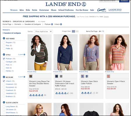
On the Lands’ End web site, an initial look at Women’s Sweaters started with 132 items. Filtering on just Pullover sweaters narrowed the list down to 43 items, and narrowing it further by selecting only V-Neck sweaters made the list a manageable 15 items. We were then able to sort by things such as Price.
- Sorting Options. Even if you have filters so that a customer can limit the products, they still often like to look at them in a certain order. For example, they may filter on TV’s between 35 and 50 inches, but they might want to sort by brand or price or user satisfaction ratings.
- Product Comparisons. This is especially useful for technical products or other products with some detailed specifications or features. Giving the customer the ability to choose two or more products (typically with an upper limit of three to five) and then pop up a list of features and how each product performs against those features can be a great way to help a customer find the right product quickly.
- Some Functions Are Best Left to the Product Detail Page. Your Category Page, with several products on it, will be busy enough. Don’t crowd it with a bunch of options that are not necessary. Many stores have things like the ability to add the item to a Wish List or to write a review. While this is great functionality, it doesn’t contribute to the task of helping the customer determine which product to explore further. If the function doesn’t contribute to that, leave it off the Category Page and put it on the Detail page only.
As always, every site is different, and so are its requirements. Not all of these guidelines will be things you need to implement. Or some might seem like it, but testing might prove otherwise. Always test your changes and measure the improvement.


