 We are often asked by potential clients for more information and examples on just how we go about optimizing a landing page for conversions. Each project is obviously very different, but examples do go a long way toward illustrating some methods of improving certain kinds of landing pages. Here is an example of a project we just finished recently to help a small ecommerce website increase sales.
Background
We were approached by the CEO of a company selling telecommunications equipment, mostly through their ecommerce site built on a Magento platform. Their store consisted of several thousand products. The CEO was concerned about their conversion rate, especially since they were spending a considerable sum on Pay Per Click ads driving traffic directly to product detail pages, from where the customer could add the product directly to their shopping cart.
After discussing various different projects we could undertake to improve things, we were asked to do a thorough review of their Product Detail page template and make recommendations based on best practices and our experience to increase orders. The same basic layout was used for each product for sale on the website, so any changes made would affect all of those several thousand pages.
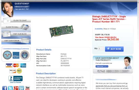
The original “before” version of the client’s Product Detail page. Conversion for this site was rather low. (Click to enlarge & see entire page.)
Most of our recommendations ended up falling into one or both of two categories: refocusing the customer’s attention on the most important areas of the page, and removing distractions.
Refocusing Customer Attention
Obviously, the primary desired action on this page is for the customer to add the item to their shopping cart. However, certain aspects of the page tended to draw the customer’s attention away from the area of the page where they would take that action.
There are often many elements to a page that tend to draw a customer’s attention. Those generally include:
• Human faces
• Motion or animation
• Colors that stand out and different colored backgrounds
Some of these can be used to our advantage to draw attention to our primary call to action. However, in areas outside of that, it is generally a good idea to remove as many of these as possible.
Make the Purchase Area Stand Out More
So to start, we want to bring more of the customer’s attention to the primary purchase area of the page, and removing elements that compete for that attention. By “primary purchase area”, I mean the section of the page that includes the price, the Quantity box, and the “Buy Now” button (the primary call to action). This area on the original page did have a slightly shaded background, but a shaded background with more contrast would make it stand out much more. So we recommended encapsulating those components of the page against a light-blue background.
Similarly, we wanted to use the “off-the-pallet” colors to our advantage. Colors not used on the rest of the page will tend to stand out a bit more and should be used for the Call To Action, but not for other components of the page. So we recommended taking all of the red bold text and styling that to be more consistent with the rest of the items on the page. At the same time, we recommended changing the color of the Buy Now button (the call to action) to one that is not used elsewhere on the page and thus stands out more.
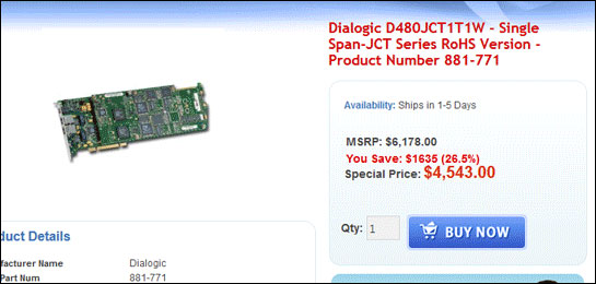
The “buying area” of the page was set against a slightly shaded background, but the difference was not enough to make it stand out. The “Buy Now” button also used the same color as the rest of the page, making it blend in more.
Faces Draw Attention First
Almost always, human faces on a page tend to draw a user’s attention before anything else. This is actually something genetically programmed into us from millions of years back—the need to determine if we recognize a face. It’s part of our human “fight or flight” instinct.
As such, the use of human faces on a key landing page should be used very judiciously. If they must be used at all, they should only be used near the primary call to action—ideally looking at the call to action.
In this case, there are two human faces on the page. The picture of the female operator at the top-left of the page is certainly drawing a lot of attention. And while a phone call from the customer is a desired action, it’s not as important as clicking the Buy Now button, and it is taking attention away from that. We recommended they replace her with a picture of a phone or no picture at all (just the text that is present there).
The other face on the page is that of the male operator in the Chat area. Ideally, his picture would be removed too. However, if that could not be done, the location of that image is low enough and far enough to the right that it is probably not doing as much damage to the customer’s focus on the Purchasing Area as the female’s.
Product Hero Shot
On a typical Product Detail page, the main photo of the product is commonly referred to as the “Hero Shot”. For this page, the hero shot is obviously the product photo. On the current page, the hero shot is pretty small, with a lot of white space around it.
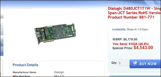
The “Hero Shot” was too small. White space is helpful, but there is enough here to allow the hero shot to be enlarged and bring more attention to this area of the page.
From a conversion standpoint, white space is generally a good thing to have on your page. However, in this case, a larger hero shot would bring more attention to that area of the page—right next to the Purchase Area. There is so much white space around the product photo, that there is room to enlarge it a good deal and still have good white space around it.
Removing Distractions
A larger category of components competing for the customer’s attention is Distractions. There are many things going on in this page that can just distract the customer from the desired action.
Too Many Calls To Action
There are a lot of calls to action on this page beyond the Buy Now button. Some of these are pretty desirable actions for the user to take. Some are desirable at other times, but not when we think they are considering a product for purchase. For example, we probably don’t want to try to entice the customer to leave this page and jump over to the Forums section of the site. That is a good thing to promote on other pages, but not on the Product Detail page.
There are four calls to action right at the top-left of the page, below the page header. And really, all four are either redundant or unnecessary.
The Click To Chat and the Click to Call are forceful suggestions that compete with the primary call to action (Buy Now) and are replicated less imperatively elsewhere on the page. They should be removed from the top-left.
The Visit Our Blog and Visit Our Forum links right below those are less important than the Buy Now, and are therefore too big of a distraction. They should be removed from this page entirely.
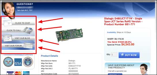
These additional Calls to Action compete with the primary CTA of the page (Buy Now), and are in the primary reading area. Removing some entirely and moving others to a less powerful area of the page will help them compliment the primary objective.
How Users Read Pages – The “F Pattern”
A great deal of research has found that instead of reading text on a page, most people scan it for important items, headings & subheadings, bullet points, etc. Eye Tracking studies have consistently shown that the main areas of user’s attention on a web page tend to resemble a capital F. Their attention is focused mainly in a horizontal strip across the top of the page, a vertical strip down the left side of the page, and a second smaller horizontal strip a little below the first one.
With this in mind, we wanted to place the most important elements of the page so that they fall close to that “F Pattern”. On the original layout, those calls to action that we recommended removal for above, along with the customer logos, credit card images, Better Business Bureau icon, and social icons take up the screen real estate along that vertical strip in the F pattern. While some of these are helpful elements to assisting the customer to convert, they may not justify the most prime real estate on the page.
We recommended moving some of these elements to other, less valuable areas of the page, or removing some of them entirely (as described above). With that space available, we could then shift the product information (picture, Purchasing Area, product details & description, etc.) over to the left. This would put the most important elements of the page (hero shot, Purchase Area, product details) right in the heart of the F Pattern.
The Customer Logos and the Better Business Bureau (BBB) seal are two very good sections which contribute to building trust with the customer. These should definitely remain on the page. However, they’d offer less distraction if moved over to the right. They should be placed toward the top so that they are still above the fold (and in the F Pattern horizontal strips). The credit card info can be of some assistance to the conversion process, but probably contributes less to that than the customer logos or BBB icon. So they could be less prominent. The social icons actually compete with the primary call to action a little bit, so they should either be removed or moved to the right column, toward the bottom.
Ensure Colored Elements Don’t Compete With the Call To Action
Many of those graphical elements described in the section above pose a risk to stealing attention away from the Buy Now button. Remember, we advised making that button be a color off the pallet of the page in order to attract attention. Things like customer logos and credit card seals can do the same thing (and we’d prefer that not happen).
Also, the rendering of the customer logos included a fading transformation from one set of logos to another so that they could show more customers in less space on the screen. But remember, animation or motion attracts the human attention. That’s another thing that is genetically programmed into us. And this is not the part of the page we want to focus the customer’s attention.
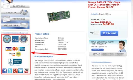
These logos and graphics use colors not in use elsewhere on the page, bringing more attention to them. The logos also fade in and out to show additional logos, and this motion draws even more attention away from the primary buying areas of the page. We could improve things by fading the color out, removing the animation, and moving them over to the right.
So we recommended changing the customer logos from color to black and white so that they don’t stand out quite so much. They’d still be recognizable and generate some trust with the client’s users, but without attracting as much initial attention.
Also, rather than just show three logos with animation to continuously load three more, we recommended just showing all of them without any animation.
The credit card logos are also made up of many colors not in use on the page. However, turning them to black and white will make them far less recognizable. So we recommended that they just keep them in their colored state, but far enough down the page that they not compete much with the Buy Now button.
Removing the Huge Amount of Text on Many Pages
On the original layout, the Product information (Details, Description, More Information) consists of a huge amount of text on most pages. The More Information section especially is quite long for most products we looked at.
This much text on a page can often be rather intimidating for the user. They see all this information, and think it is probably important, but do not want to read through it all. They start thinking about things other than buying the product.
A better way is to make all this information available for those who are actively seeking it, but having it not appear by default, so that the page looks cleaner for most users. A great way to do this is with tabs.
We suggested making each of those three sections a tab, with the Product Description being the tab that is open by default (or possibly Product Details, depending on what the users find most important). Users could then click on any other tabs to view the corresponding information.
Using a tabbed approach for these sections would shorten the page significantly and make it much more inviting for most users.
Revised Page Layout
Taking all of the changes above into consideration, we mocked up a layout that we thought would likely perform much better. You can see we got the distractions out of the primary vision area (the F-pattern) and where they could act better as supporting information. We made the buying area stand out much better with a darker shaded background and an orange button. The larger hero shot also calls attention to the most important area of the page. And with the tabbed sections for all of the various pieces of product information, the page is much shorter and more inviting.
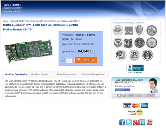
A mockup of a revised version of the page incorporating our recommendations. The client implemented most of these changes and saw great success with the resulting layout.
(Click to enlarge & see entire page)
Our client did not implement the layout exactly as this. They did choose to implement the vast majority of our recommendations, however, and the resulting page did look very similar to this one.
The Results Were Great!
In an ideal situation, the client would A/B test these recommended changes against the original page to prove statistically whether one version was outperforming the other or not. However, this customer was anxious to improve things quickly. Further, they do not historically experience much seasonality and there were no external variables we could determine which might skew results. So the client preferred to implement the new design immediately and judge performance comparing results of the new layout to the old.
Again, to reiterate, this is not a scientific method to judge one design compared to another. However, we are confident that the environment in this case was such that we can draw certain conclusions based on the before and after data. And it was important to our client that we roll the new page as soon as possible even if it compromised certain learnings (and their certainty).
In this case the results were excellent. When comparing the new layout to the old either against the most recent months, or the same time period of the previous year, conversion rate improved by a little over 100%, and revenue per visit increased by at least 68%. Based on recent traffic levels, the improvement projected to be an increase of nearly $1.2 million per year. Needless to say, our customer was quite pleased with the improvements!
How Well Is Your Website Performing?
Think there are areas on your site that could be improved? Contact us to discuss how we can help you better your bottom-line numbers from your site.
