The key landing pages on your web site are among the most important parts of your entire business. So why aren’t they converting?
By far, the issues we see most often with new clients’ landing pages fall into the category of “Too Much/Too Many”. It’s good to make a site easy to use and to provide a pleasant user experience, but for pages that are part of the conversion process (and which are not?), it’s important to enable “ready” users to stay focused on the task. Having too much clutter on the page can detract from that. What is there too much of on your landing pages?
Too Many Distractions
More often than not, if a page has too much of something, it is too many distractions. Distractions on a landing page can take many forms, but they are all temptations for the user’s eyes and brain to look at, think about, or act upon something other than one of the true desired goals of the page.
Motion & Animation
One of the most common distractions these days is motion & animation. This comes in many forms, from a simple animated GIF on the page, to an auto-scrolling Twitter feed, to auto-playing video. But today the most common seems to be a rotating carousel of photos, product information, offers, etc.
All forms of motion on the page trigger a portion of our brain that is genetically programmed to respond. It is our “fight or flight” filter that instantly draws our attention to motion. That might be good for surviving in the wild, but not so good for keeping the user focused on the primary objective.
If you have a photo carousel on your page, consider replacing it with just a static image and testing the results. If you have other forms of motion, experiment with eliminating them.
People & Faces
Another very common distraction is people—or at least photos of people. Again, the instinct to focus our attention immediately upon a face is something that is deep inside all of us. A human face will almost always be the first thing someone looks at when viewing a page. There are of course cases where a photo of a person is needed, but more often a page has a needless stock photo of a model performing a generic task randomly associated with the product or service being promoted on the page.
Think about how you can eliminate photos of people’s faces on most of the pages of your site. Replace photos of people using a product with detailed photos of the product itself. Or make the product the focus of the photo by using an angle that does not include the model’s face.
Here’s another tip. If you do need to use a person’s face on the page, it’s a good idea to have that person looking directly at your Call To Action. This can help redirect the desired attention back to where you want it.
Pop-Ups
Pop-up ads were the scourge of the early 2000s. They pretty much went away, but now we have their children, the pop-up modal boxes or lightboxes. There are effective uses of these, but most are not. Any pop-up, whether done immediately upon entry, after a certain amount of time, or upon exit, can only serve to interrupt the user and distract them from the primary task. The use of any pop-up should always be tested to see how it affects things like conversion, bounce rate, etc.
Social And Other Off-Site Icons
Social Marketing is an important component of just about any web site these days. So it’s good to get people engaging with your content and your social profiles on networks such as Twitter, Facebook, etc. But think about where you have icons such as “Like us on Facebook” on your important landing pages. It’s great for someone to want to click on an icon to get to your Pinterest page, but not if it stopped them from adding something to their cart or filling out a lead form.
Icons that simply link to your profiles on other social networks should be out of the way on key Landing Pages, such as in the footer. If someone wants to find them, they will. Buttons such as “Share This” or “Tweet This” can be useful on a product landing page, but should be inferior to the primary call to action. These kinds of buttons are much better for blogs and articles, where sharing is one of the primary objectives.
Too Many Calls To Action
We often see many landing pages that just have too many different buttons, links, or banners asking you to do something. Getting someone to sign up for your mailing list is great, but do you really want that request to compete with them filling out your primary lead form? Many pages have multiple actions that are of value to the site owner, but most have one primary objective. The Call To Action (CTA) for this should stand out above everything else.
It’s not unusual to find landing pages with four five different CTAs on them. Below, see the page I got when I clicked on an ad for My Fit Foods, a company that prepares nutritious meals for home consumption in several states in the Southwest (none of the sites profiled in this post are or have been Web Site Optimizers customers).
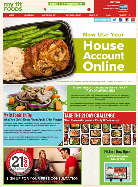
My Fit Foods landing page. What do they want me to do? I count at least eight Calls to Action here. (Click for full size)
What is it they want me to do? Login or Register? Take a 21 day challenge? Subscribe to the newsletter? Find the nearest location? Order online? Use my House Account (whatever that is)? Go to their Twitter or Facebook page? Sign up for a free consultation? That’s at least eight different calls to action on this page (which is also their Home page).
I imagine that the most valuable action to My Fit Foods would be for you to sign up for a consultation so they can get in front of you and sell you personally on their concept. Yet that CTA is at the very bottom of the page, well below the fold. Probably the next most valuable action would be for you to locate the nearest store, again in hopes you would go there in person. The store locator, while at the top, is very faint and does not stand out, and is right next to a more prominent CTA (newsletter subscription). Even for a Home page, there are just too many competing calls to action here.
Too Much Copy
When we conduct Usability Studies, we are very diligent in ensuring that our test subjects think out loud throughout the test. This includes verbally reading aloud all of the copy they are reading on each page. Rarely do they read more than a couple sentences on a page. Even more rarely do they digest that text. It’s a fact of life on the web.
So how do you convey important points and key benefits of what you are promoting on your page? In many cases, it’s just not possible to illustrate them with pictures. The keys are to keep the text as short as possible, and to write the copy in a “scannable” format.
By “scannable” I mean copy that is broken down into short paragraphs with headings and sub-headings so the reader can quickly identify what is important and pass over what is not. Definitely put the most important things first, near the top. Using short bulleted lists also breaks up a paragraph to make it more inviting to read. A long, uninterrupted page of text is what I call “intimidating”. The reader sees it and has no idea what information is important and what is not. So they just don’t want to bother reading it at all.
The page below is from a prominent operator of cruise ship excursions in Alaska. The page is essentially full of hard to read text. I believe very few people would read much beyond the headline. This page could be made so much better by breaking it down into sections such as Available Dates, Price, Transportation, What to Wear, and Cancellations, with the headings being in a different and larger font and each paragraph being just three or four lines long.
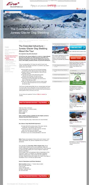
ERA Helicopters landing page for “Juneau Helicopter Tours”. This page has so much copy it is “intimidating” to read. Breaking things up into shorter paragraphs with section headings could help immensely. (Click for full-size)
Too Many Choices
It’s a common philosophy that customers like choices, and that is true to a point. But presented with too many choices, customers become uncertain. When presented with way too many choices, they just become bewildered.
Consider the screenshot below of a site that sells remote control helicopters. This is their Home page, but it was the landing page for an ad I clicked on when searching “remote control helicopters”. This page has entire sections of too many choices!
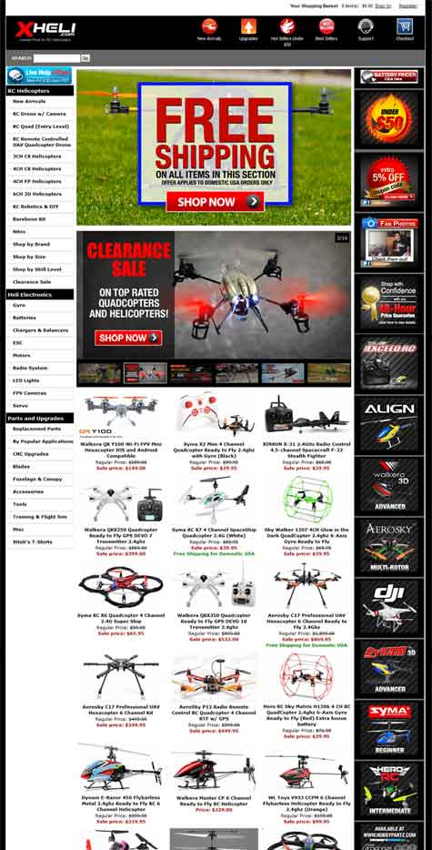
With 30 products featured, a carousel with 10 more featured items, and 21 banner ads going down the right hand side, there are just far too many choices on this XHeli landing page. (Click to see full size version, which includes the full page.)
If you click the image for the full version, you’ll see that they show 30 different helicopters on that page, ranging in price from $20 to $870. This site is clearly targeting avid helicopter hobbyists, but it would also seemingly be a good place for someone shopping for a gift to go. I bet that these make excellent gifts. Can you imagine how overwhelmed someone would be just looking at those 30 choices presented on the page?
Beyond that, there are more sections of the page with too many choices. There is a rotating carousel with an astonishing 10 different items. I’ve already talked about how carousels can distract, but 10 different items in the carousel is by far the most I have ever seen on an online store. The menu on the left hand side has 35 different options. If you count the sub-menus that appear when you hover over certain choices, it is an astounding 479 different menu items!
There are also 21 different banner ads going down the right hand side of the page. Not even counting navigation links on the left, top, and bottom of the page, there are 67 different graphical elements that can be clicked, clamoring for attention on this page. And all I wanted was a remote control helicopter for my nephew.
If you have a whole bunch of products on a page, you’re much better off finding ways to categorize things and start a user down a path which results in a much smaller set of choices. In this case, the landing page could have started with options to browse by price level, by intended use, by brand, etc. And each of those could lead to one more set of choices to reduce the number of products substantially. If you look closely, you can see choices like that do actually exist in the left-hand navigation. But that’s just it—you have to look very closely. Most people won’t notice those among the 35 menu choices there.
It’s Time To Clean Up Your Landing Pages
So how busy are the key pages on your web site? Take a good hard look at the Home page, your product pages, your chief lead-gen pages. Look at the pages that play a key role in the conversion process. Do they have too much going on?
Can you reduce the amount of copy and still convey the important points? Are you using motion on the page that can be replaced with something less distracting? Is your primary Call To Action clear and does it stand out? Can you replace a large set of options with a few entry points to help funnel the visitor to their optimal solution choices?
Now is the time to look at simplifying your pages and increase their conversion rates. Leave a comment to talk about what you’ve found and what improvements you are trying.





Pingback: What SEO can teach PR, what PR can teach SEO()