From Rags To Riches – The Pauper’s Guide to Optimizing Your Site’s Performance (Part 3)
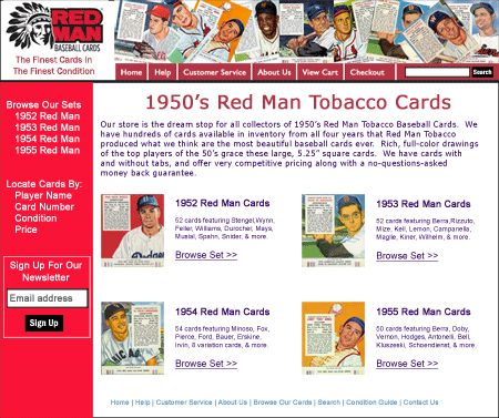
A couple months ago, I began a three-part series on how you can achieve meaningful web site optimization even when your budget is limited. In Part 1, I covered analytics and why it’s important to set them up accurately and track them. In Part 2, I talked about how basic usability testing can quickly uncover the “low-hanging fruit” in terms of identifying the most critical hurdles your customers are facing that stop them from converting. Also in part 1, we introduced our hypothetical example site, RedManBaseballCards.com, an online store that sells, well, Red Man baseball cards.

Our hypothetical example web site: RedManBaseballCards.com, an ecommerce site.
Now that you’ve made sure that your site is pretty easy to use, and you can measure how changes to your site affect your bottom-line Key Performance Indicators, it’s time to start improving individual pages.
Start With Your Most Important Pages
To get the biggest bang for your buck, be judicial with which pages you choose to start looking to improve. Look at your analytics for the past month or two. Which pages are viewed the most often? Which are pages are your top Landing Pages (also called Entry Pages)? Which of these have high Bounce Rates? Which of these play the biggest role in the conversion process?
Certainly, if you are running search engine ads or other online ads, the pages those ads point to are important. You’re paying money to send people to those pages, so you definitely want to make sure they are effective. (And if any of your ads are sending traffic to your home page, you’re probably wasting your money.)
In our RedManBaseballCards.com example, the Home page might be the page most often viewed, and the most common landing page. That’s obviously an important page. However, suppose that when we add up all of the views of the detail page for each different card (product) we have on the site, those page views and entrances outnumber the Home page. And these pages are certainly more directly on the conversion path. It is on these pages where the customer is deciding whether or not to add the product to their cart.
What Do You Want The Customer To Do?
Just as in Part 1, where we asked what actions we want users performing when they come to your site, we want to ask essentially the same question for each page on your site. What do you hope for that page to accomplish? In some cases, it could be that you just want the customer to come away with information that is important to them. Your Return Policy page could be such an example. However, in most cases, you want the page to play a more direct role in converting the customer.
Most pages should have a very clear call to action (CTA) that stands out clearly on the page. The landing page on a lead-generation site would have a clear, easy to complete form for the customer to fill out. A product category page could have a CTA to explore specific products. A product detail page would have an Add To Cart call to action.
Your call to action is the most important component of your page. Keep that in mind while evaluating your page against some basic best practices.
Key Best Practices for Web Page Optimization
You may not have the budget to hire a Web Site Optimization firm, but there are some clear best practices that are well documented that you can review your important pages against. Here are some of them.
- Make Your Call To Action Stand Out – We covered this a little bit above, but your call to action should be very clear, placed above the fold, and stand out with plenty of white space around it and/or placed against a slightly different colored background.
- Minimize Distractions – If you want your customers to focus on your CTA, then you definitely want to keep other things that will distract them to a minimum. This includes generic stock photos, unnecessary photos of people, animation or other motion on the page, and too many buttons or links outside of the standard navigation.
- Requiring Too Much From Your Customer – Perhaps you have a lead form on your page, or the page you’re working on is part of your checkout process. Maybe you have a “Donate Now” form on your page. In any case, when you’re asking for your customer to do something, don’t require any more than absolutely necessary. I’m amazed at the number of online stores that still require you to create an account during checkout. Many people don’t like to do that, and even more don’t like to be required to do so. If it’s a lead form, ask for the absolute minimum that you need to contact the customer. Requiring other personal information will increase their likelihood to exit the page.
- Make The Text on the Page Easy To Scan – this goes hand-in-hand with #2 above. Too much copy on a page is a distraction to the CTA, and certainly will not be read very often. Reduce the amount of copy as much as you can. Try to present the key benefits with bullets rather than long paragraphs. Short, bulleted text will be less intimidating to your customers. It won’t look like such a chore to read and more people will scan it to pull out the key points.
- Try to Keep Choices to a Minimum – A product page that shows 25 different color options, or a category page that shows 25 products will generally not convert as well as one that has just a few different options. Your customers will spend too much time evaluating those different colors and many will be left with questions or just tire on the page without adding the product to the cart. Consider reducing the number of choices to just those that sell best, or offer a link for more options.
- Add Trust & Credibility – I’ve talked about Trust before and how it affects conversion. But there are specific elements you can add to your page to add to your credibility and build trust with your customers. Things like site security seals from Verisign, McAfee, etc., user reviews and/or comments, and clear links to your policies on returns, shipping, and privacy can go a long way to building trust.
Our Example Site
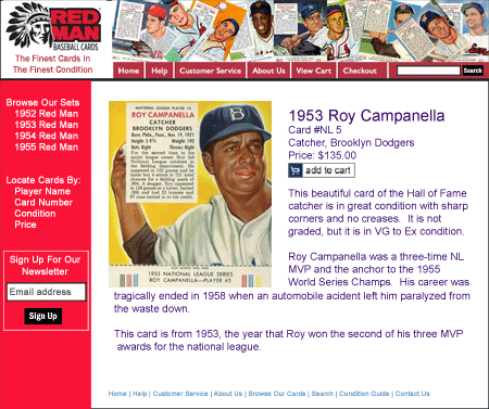
We suggested above that we might start with the Product Detail page of our RedManBaseballCards.com hypothetical web site. Suppose those pages look something like this:

The initial layout for specific product detail pages. How could this be improved to increase conversions?
The call to action on this page is certainly to add the item to the cart (although there is a secondary CTA to sign up for the newsletter). However, the Add To Cart button doesn’t stand out completely. It’s stuck in the middle of a bunch of text and is the same color as that text. We might want to change the color and add some white space around it.
The main focus of the eyes is the “hero shot” of the card for sale, and that’s great. That should be the focus point of the page, enticing and interesting the customer. But then, we’d want to clear the way for them to add to the cart.
There is a lot of copy on that page that doesn’t contribute much to the sale. All the biographical text about the player on the card is not what most potential buyers care about. The text gets in the way, and is too long for people to read. So we might want to try eliminating most of it and just putting the factual information about the card on the page. This can create some white space to help the Add To Cart button stand out as well.
We could use some trust-building components in here as well. Adding comments from past purchasers of this card could help. If there were room to get them in above the fold, I’d try adding a couple of seals from the SSL certificate provider and from Authorize.net, who processes the credit card. However, I’d shade them in grey and white to make them stand out a little bit less and not compete with the Add To Cart button.
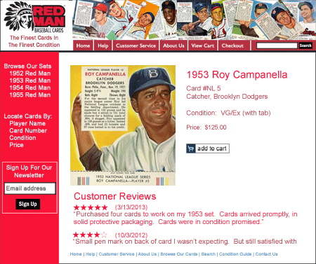
That page could possibly be changed to something more like this:

Revised version of Product Detail page.
This new version does not incorporate the site seals we mentioned above because we had difficulty finding room, but a future test could be to rearrange things so those seals could be seen above the fold. Instead of changing the color of the Add to Cart button, we changed the color of all the text, keeping that in line with the color pallet used on the page, and resulting in the button to be outside that pallet, which helps it stand out.
Test Test Test
The above list is just the beginning of areas to consider for improving your page’s performance. But it’s important to remember that there are no hard-fast rules. For some sites, having more choices may work better than having just a few. The practices above simply serve as places to start to form hypotheses for improving your site’s performance. The only way to find out for sure if a hypothesis is true is to test it.
Performing A/B Tests refers to making a change to your page (or template), and showing the old version to some visitors, the changed version to the others, and measuring which one performs better. There are many tools out there that can assist you in doing this, such as Optimizely, and Convert.com. Google Analytics has a free tool called Content Experiments that can assist you with some of this as well.
Generally, these tools help you implement the different versions of the page(s) you are testing, and will serve the different versions randomly to your users and measure the results. They will measure those results until one out-performs the other to a statistical confidence level.
Even if you can’t invest in one of the tools above, you can still make the change yourself and implement it for all users and measure to see if your KPIs improve with the new version. You can’t remove external variables such as seasonality with this method, but it’s still better than sitting around hoping that conversions improve without taking any initiative.
Finally, Optimization Is An Ongoing Process
Once you’ve gotten so far as fine-tuning specific pages on your site, don’t think your work is finished. It’s just beginning! It’s important to establish a structured approach to web site optimization so that you’re continually improving your site. The online environment is constantly changing, and what is working now won’t necessarily work forever. The way your customers use your site will change over time. You must adapt to these changes.
Prepare and implement a schedule for regular usability testing to stay on top of what your customers are doing and what their expectations are. Schedule regular review sessions to develop hypotheses to test for your critical pages. And continue to read blogs like this one, as well as many of the excellent books on the subjects of analytics, usability, and web page optimization to get new ideas. Who knows? Becoming the next Amazon might be in your future!


Pingback: Usability Testing - THe Pauper's Guide to Optimizing Your Site's Performance (Part 2)Tom Bowen's Blog – Web Site Optimizers()