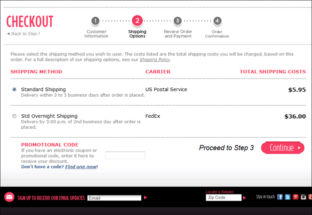
All diligent online retailers are fighting the battle against Abandonment Rate. There are so many places to start looking when trying to plug holes in the conversion process. Today, I want to provide an example of how we looked at things once customers had actually begun the checkout process.
People can add items to the shopping cart for a number of reasons that don’t necessarily mean they intend to actually purchase. Sure, there will be people who start a checkout process for reasons other than to actually order, but the percentage is much lower. For the most part, people who start checking out are much more committed than someone just adding a product to the cart.
So for one of our customers, we wanted to start there, in the checkout process. And one of the first places we looked, was on the page offering the temptation of the tantalizing Coupon Code.
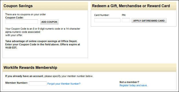
One of the largest online retailers in the world, Office Depot, has has many as three different prompts for discount codes in their checkout process.
You know the Coupon Code box at checkout (sometimes called Discount Code or Promo Code). Almost all online stores have them at some step in the process. Pretty much all shopping cart solutions offer them as an option in the implementation. And by now, most online retailers are aware of the fact that so many would-be customers see that box without having a code, and it does tempt them. They want a code!
The Problem With Coupon Codes
So off they go, generally to a search engine, searching for a coupon code for your store. Often, they don’t find one and get frustrated and change their minds about ordering. Sometimes they find one, but it is no longer valid, also frustrating them. Sometimes they get lost searching for a coupon code and get so distracted they never come back.
A study a few years back by ComScore found that 27% of online shoppers had abandoned shopping carts because they wanted to look for a coupon.
Many conversion experts these days are recommending the complete removal of the coupon code box from your store’s site. However, for many online retailers, that is just not an option. Many stores have built-in marketing systems that rely on the coupon code.
What’s An Online Retailer To Do?
There are many recommendations on how to improve this situation. Some recommend adding intelligence to your site to only show a coupon code box when you know the customer has one, such as if they came to your site from a specific email with an offer. I’ve heard others recommend encoding an incoming url from such an email so that the discount is built-in automatically, without need to actually enter the coupon code. Others have said to “disguise” the field by calling it something less obvious, such as “voucher code”.
For an online store with a marketing strategy that relies on the ability to offer coded discounts, I’m not a fan of any of those remedies. Customers come to a site in so many different ways, even after they’ve become aware of the offer. Giving them the option to enter the code only when clicking the link from the originating email is too restrictive. And online shoppers are far too savvy today not to recognize a Coupon Code box when they see it, regardless of what you call it.
Self-Hosted Coupon Code Page
While attending Conversion Conference last October, Charles Nicholls of SeeWhy mentioned that department store Macy’s had seen great success by putting a link right next to the Promo Code box, inviting any customer to have a look at all of the Promo Codes currently valid. The philosophy is that the visitors stay on the site and that the transparency will satisfy the customer instead of frustrating them with the prospect of missed savings.
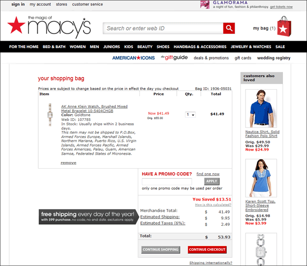
Macy’s includes a link right next to the Promo Code prompt to see a list of all currently available promo codes, allowing the customer to review them without leaving the site. (Click for larger version.)
Macy’s reported that 40% of the visitors to that special Promotions page ended up converting in the same session. This was one of several very interesting items I took away from Conversion Conference. (You can see more at the blog post I did shortly afterward.)
One of our clients wanted to implement this concept with the hopes of decreasing abandonment. In doing so, we started with the Macy’s concept, but tried to improve upon it a bit.
Our Implementation
When a customer clicks the link on the Macy’s site, a separate browser window (not a tab) opens up showing the promotions available (see the figure below). We liked how the customer is not taken off of the checkout page, but a pop-up window still seemed just a little messy. So we chose to do essentially the same thing, but with a lightbox.
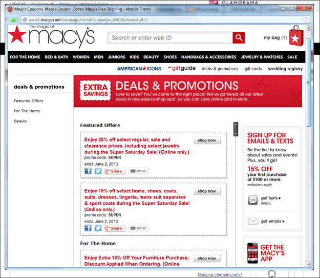
When clicking the link, Macy’s pops up a new browser window to a page listing all currently available codes.
(Click for larger version.)
We also wanted it to be as simple as possible for the user to enter the correct code. So while the Macy’s version requires the user to either remember or copy the coupon code, shut the window, and then type or paste the code into the box on the original page, we chose to allow the user to simply click on the code they want, which automatically closes the lightbox and populates the field on the checkout page.
Finally, some of the promotions on the Macy’s page are somewhat ambiguous as to which specific products qualify for the offer and which do not. So our client makes sure that each offer is very specific, while still as brief as possible.
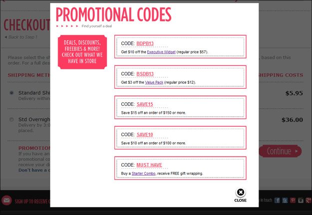
In our implementation, the available codes are listed in a lightbox, so the user truly never leaves the page. Simply clicking on a code closes the lightbox and fills the code into the checkout form.
Results
The result thus far have been excellent. Our client is able to specify in the system which codes will appear in the lightbox, and which are “private” (typically sent to a small set of customers as a special offer based on prior activity). But more importantly, conversion has seen a double-digit lift.
This client’s product offering is not nearly as broad as Macys, so their conversion rate once visitors had begun checkout was already pretty good. However, in our split A/B test, this implementation clearly outperformed the original solution of a plain coupon code box with no link to view available codes, improving conversion rate 12% and total revenue by 17%. Now that this solution is implemented for all visitors, conversion rate for people reaching the Coupon Code step in the checkout process has seen a 22% lift to date.
Conclusions
This solution to “Coupon Code Search Leak” clearly seems optimal to me. The whole thing can easily be tied to your store’s database of valid codes, and it was fairly cheap to implement. The conversion lift has already paid for the cost of implementation.
Further, like most of our clients, this client has consistently seen a distinct correlation of the use of coupon codes to improved revenues and profitability of the web site. So this improvement has been classified a strong victory.


